
Quote of the Day
20 years from now, the only people who will remember that you worked late are your kids.
— Something I saw on a Reddit post. I don't recall which one. Young parents need to remember this.
Introduction

Figure 1: Mosquito Magnet I am testing. (Amazon)
I do not like mosquitoes — who does? To reduce the number of mosquitoes at my Northern Minnesota cabin, I decided to buy a Mosquito Magnet (Figure 1). I bought it last year, and while it ran for a while, it soon gave me an error warning (fast flashing LED) and stopped working. I live in a remote location, and getting things serviced is difficult, so I put it away for when I had time to look at it.
Unfortunately, we have quite a mosquito population this year, and my family has demanded that I take active measures to reduce the mosquito population. So I pulled the Mosquito Magnet out of storage and repaired it with the help of a Youtube video (Link).
It turns out I had a loose thermistor, and I was able to secure it in place. While repairing it, I also went through the cleaning process (Link).
I decided to do a little testing and gather a little data. In this post, I will look at the unit's rate of propane use. I will discuss its effectiveness in capturing mosquitos in a later post.
Background
Analysis
Test Method
I am working this summer from my cabin's garage. During the day, I walk between the garage and my cabin multiple times. The Mosquito Magnet is along the path between the cabin and the garage, so I stop during my walk and use a fish scale to measure the propane tank weight.
I performed the test over four days because I suspected the flow rate would vary by the tank pressure. While I did not measure the tank pressure, I did measure the weight of propane in the tank, which should be related to the pressure.
Data Analysis
Propane Weight Calculation
Equation 1 can be used to calculate the weight of propane left in the tank.
| Eq. 1 |  |
where
- WPropane is the mass of propane remaining in the tank, which we compute using Equation 1.
- WTank is the measured weight of the propane tank (my measurements). Government regulations limit the fill value on a "20 lb" tank to 80% of its volume rating for safety reasons. So my local propane vendor fills my tank to ~34 lbs, which means they put in 17 lbs of propane.
- WTare is the empty weight of the "20 lb" propane tank. My tank has an empty weight of 17 lbs.
My tank weight measurement was subject to some variation because I was holding the propane tank in the air by the scale. Fortunately, I took lots of measurements over time, and the errors should average out.
Vendor Propane Burn Rate Specification
The Mosquito Magnet vendor states that a 20 lb propane tank should last ~3 weeks. We can compute the expected burn rate using Equation 2.
| Eq. 2 | 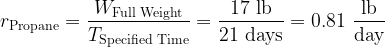 |
where
- WFull Weight is the mass of propane remaining in the tank.
- TSpecified Time is the run time specified by the vendor (21 days).
Visualization
Estimated Propane Use Per Day
The unit stopped running when the amount of propane in the tank reached ~2 lbs. Figure 2 shows the tank weight versus time on day 2 of the testing. Day 2 began with 7.7 lbs of propane in the tank — a couple of pounds shy of halfway full = 9.5 lbs = (17 lbs+2 lbs)/2. All of my data is in the worksheet attached here. The rate of use did vary by day. The more propane in the tank, the higher the burn rate.

Figure 2: Measured Mosquito Magnet Propane Usage.
The tank had 7.7 lbs of propane at the start of the test.
Variation in Daily Propane Use with Propane Weight
Figure 3 shows how the propane burn rate varies with the weight of propane in the tank. This figure shows that the propane burn rate reduces as the tank depletes. I would estimate the average burn rate for 9.5 lbs of propane as 0.74 lbs/day = 0.70 lbs/day (7.7 lbs value)+ 0.02 lbs/day/lbs ⋅ 2 lbs. This is pretty close to the vendor's value of 0.81 lbs/day, considering the crudeness of my measurement technique.

Figure 3: Variation in Daily Propane Use with Tank Weight.
Conclusion
The Mosquito magnet does use ~0.81 lb/day of propane when averaged over a full tank. However, the rate of propane consumption varies with the amount of propane in the tank.


