Quote of the Day
Fabius used to say that the basest excuse for a commanding officer is 'I didn't think it would happen,' but I say it's the basest for anyone.
— Seneca, from his book 'Of Anger.' My management failures were all from lack of imagination – I didn't think it would happen.
Introduction

Figure 1: Weed and Feed Fertilizer Bag I Found.
Two weeks ago, the grass around my garage looked pretty scraggly and weed-infested, so I decided it was time for fertilizer and weed-killer. I am not very knowledgeable about lawns and lawn care, so I decided to research online. This research is summarized in this post. Yes, it was time for some fertilizer and weed-killer.
Since the nearest lawn care store is 40 miles away and the COVID delta variant is active, I decided to dig around my garage for my old yard supplies and found a bag of a common weed and feed product that I had purchased years ago but never applied (Figure 1). There are pros and cons to this product, but it is here and easy to use.
This post will use US customary units because the product and my lawn are all specified in customary units. The bag is rated to cover 15,000 square feet of lawn. I have about 10,000 square feet of garage lawn, so I have enough for one application.
All my analysis was performed using the MapleFlow computer algebra system, which I am trying out for my engineering work.
Background
Reference
I decided to use the following sources for my information on fertilizers
- North Carolina Department of Agriculture and Customer Services (link)
- University of Georgia Extension Service (link)
- Texas A&M Extension (link)
Their information is well-laid out and easy to use.
Definitions
- NPK Numbers
- Every fertilizer bag has a string of three numbers on it (e.g. "28-0-3"), which refers to the nitrogen (N)-phosphate (P)-potash (K) percentages by weight. The nitrogen is usually supplied by the chemical urea (CH4N2O). Phosphate (P2O5) and potash (K2O) supply phosphorus (chemical symbol P) and potassium (chemical symbol K), respectively.
This actually an inconsistent way to express these values because the numbers express nitrogen (elemental)-phosphate (compound)-potash (compound) percentages. This means you have a bit of stoichiometry to do if you want to determine the amount of phosphorus and potassium spread. However, folks usually worry about nitrogen, so it makes sense to express that percentage directly.
Parameters
There are three parameters that I want to compute.
- Fertilizer Rate [lb/1000 sq. ft.]
- The weight of fertilizer (lbs) applied per 1000 square feet of lawn.
- Nitrogen Rate [lb/1000 sq. ft.]
- The weight of nitrogen (lbs) applied per 1000 square feet of lawn.
- Fertilizer Spreader Setting [unitless]
- The setting on my fertilizer spreader corresponding to my desired fertilizer rate.
Analysis
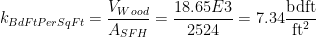
Fertilizer Rate
The fertilizer rate can be computed as shown in Figure 2.

Figure 2: Fertilizer Rate Calculation.
Nitrogen Content
Texas A&M says that you should never apply more than 1 lb of nitrogen per 1000 square feet of lawn. Figure 3 shows my analysis of Scott's Weed and Feed to determine the amount of nitrogen that will be spread according to their instructions. My numbers show that 0.8 lbs of nitrogen will be spread per 1000 square feet of lawn, which is reasonable.

Figure 3: Nitrogen Density.
Ideally, I would have performed a nitrogen test on my lawn to determine exactly the amount of nitrogen that I need to apply to my lawn. As usual, I am in a hurry, and performing the testing probably isn't worth it on a lawn that is clearly low on nitrogen (my grass is thin, and has many yellow spots).
Dispenser Calibration
I use the fertilizer spreader shown in Figure 4 (Scotts EdgeGuard DLX broadcast spreader). The rate of fertilizer spread is controlled through a dial that is numbered from 2 to 15 around its circumference.

Figure 4: My Fertilizer Spreader.
I needed to calibrate the dial for my fertilizer to determine the correct setting for the fertilizer I am applying. I decide to apply fertilizer on three measured patches of lawn at three different settings to determine the rate versus dial setting. My test process is simple and for each test I:
- Measured the patch of grass to get its area
- Put fertilizer in the spreader and weigh the whole thing
- Spread the fertilizer at the specified test setting over the test area
- Weigh the spreader and fertilizer afterward to determine the amount of fertilizer spread
- Record the weight of fertilizer spread, test area, and calculate the fertilizer rate.
My test data is shown in Figure 5. I started my testing with the setting S=6 because of an online recommendation. I found out that setting gave me too high a fertilizer rate.

Figure 5: Measured Pounds Per 1000 Square Foot.
I performed the linear regression shown in Figure 6. It looks like the relationship between the fertilizer rate R [lbs/1000 sq. ft.] and the spreader dial setting S is shown in Equation 1.
| Eq. 1 |  |
where
- R is the rate of fertilizer spread [lbs/1000 ft2]
- S is the spreader dial setting [unitless]
- I am ignoring the intercept because it is small
Figure 6 shows the graph of my data.

Figure 6: Fertilizer Calibration Test Regression.
Application Pattern
I spread the fertilizer two weeks ago and I can see that stripes in my lawn, which indicates inconsistent spreading. Next time, I will cut the application rate in half and spread the fertilizer in a criss-cross pattern (2 passes).
Conclusion
Based on my test results, I needed to set my spreader to S=2.858/0.665=4.3. I applied the fertilizer 2 weeks ago. My grass has really greened up and the weed situation is better, but there is still a weed problem. I will need to focus on this for a while.
PS
My wife watched a Youtube yard care channel (I don't know which one), and their calibration setting for the same spreader and fertilizer was 4.4. So I think my results are at least partially confirmed.