Estimating Asteroid Sizes Using Excel 2D Data Table

Quote of the Day

I do not give  performance guarantees because I provide the most flawed product known – people.

— Dave Neville, corporate recruiter


Introduction

Figure 1: Asteroid 2011MD.

Figure 1: Asteroid 2011MD. (Source)

I recently gave a seminar on how to design products using Thermoelectric Coolers (TECs). During this presentation, I showed the audience how to generate various tables and graphs using Excel data tables. I was surprised to learn that no one in the audience had ever seen an Excel data table in action. Since the middle of a seminar on TECs is probably not the best time to divert to some Excel training, I decided to prepare a simpler example that would be easier to understand on first exposure.

My amateur astronomy activities soon provided me an excellent example. We often hear of Near-Earth Objects (NEOs) or asteroids  in the press (Figure 1). The sizes of these objects are estimated using a simple formula that is based on the objects brightness (i.e. absolute magnitude) and the percentage of incident light it reflects (i.e. albedo) – a perfect application for a data table.

Let's dig in …

Background

You can skip the background material if you do not wish to know the details behind the formula used to create the data table.

Scope

While crawling around the Jet Propulsion Laboratory web site on solar system objects, I found a table of asteroid sizes versus absolute visual magnitude and albedo. In this post, I will duplicate that JPL table using an Excel's data table, rounding to two significant digits,  and custom format features. This example provides a useful vehicle for illustrating how to use an Excel for a typical scientific application – the evaluation of a two-variable function.

Definitions

The following definitions are repeated from this earlier blog post that was focused on using Mathcad.

Apparent Magnitude (V)
The visual brightness of an asteroid when observed and measured visually or with a CCD camera. (Source)
Absolute Magnitude (H)
The visual magnitude of an asteroid if it were 1 AU from the Earth and 1 AU from the Sun and fully illuminated, i.e. at zero phase angle – a geometrically impossible situation. (Source)
Geometric Albedo (pV)
The ratio of the brightness of a planetary body, as viewed from the Sun, to that of a white, diffusely reflecting sphere of the same size and at the same distance. Zero for a perfect absorber and 1 for a perfect reflector. (Source)
I smiled when I read this description of geometric albedo – it is VERY similar to the description of target strength as used by the sonar community. I am always amazed at the similarity between the various engineering and scientific disciplines.
Bond Albedo (A)
The Bond albedo is the fraction of power in the total electromagnetic radiation incident on an astronomical body that is scattered back out into space. The Bond albedo is related to the geometric albedo by the expression A={{\rho }_{V}}\cdot q, where q is termed the phase integral. We will not be worrying about the Bond albedo for this post. (Source)
Equivalent Spherical Diameter
The equivalent spherical diameter of an irregularly shaped object is the diameter of a sphere of equivalent volume. (Source)

Asteroid Diameter Formula

JPL uses Equation 1 to estimate an asteroid's equivalent spherical diameter.

Eq. 1 \displaystyle D\left( {{{p}_{V}},H} \right)={{10}^{{0.5\cdot \left( {6.259-\text{log}\left( {{{p}_{V}}} \right)-0.4\cdot H} \right)}}}

where

  • D is the equivalent spherical diameter of the asteroid [km].
  • pV is geometric albedo [dimensionless].
  • H is absolute magnitude of the asteroid [dimensionless].

I have never seen Equation 1 before, however I have seen Equation 2 in a number of papers and websites (example), including the Minor Planet Center.

Eq. 2 \displaystyle D({{p}_{V}},H)=\frac{{1329}}{{\sqrt{{{{p}_{V}}}}}}\cdot {{10}^{{-0.2\cdot H}}}

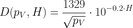
The detailed derivation of Equation 2 is a bit involved, but quite interesting. See this document for details (section 4.2).

Equation 1 appears to be different from Equation 2, but simple algebraic manipulation shows it to be almost identical – only a minor difference in the leading coefficient.

Figure 2: Equivalence of Equations 1 and 2.

Figure 2: Equivalence of Equations 1 and 2.

For my work here, I will use the JPL formula (Equation 1).

Analysis

The actual workbook is included here for those who wish to see the details. If you want a step-by-step guide to making a data table, see this video by Danny Rocks – a bit old, but I have always thought Danny gave the best tutorials.

Figure 2: Good Video Briefing on Spreadsheet Work.

The key points for my specific example (Figure 3) are:

  • The data table function will substitute all the albedo values in into the row input cell.
  • The data table function will substitute all the magnitude data (H) into the column input cell.
  • The function output goes into cell C16. I placed a reference to cell C16 in cell B18, which the data table function uses to obtain the table values.
  • I covered B18 with a couple of text boxes so I could label the row and column data.
  • As JPL did, I rounded the data to preserve 2 significant figures.
  • I used a custom number form ("[<1]0.####_0;[<10]0.0_0;0_0") to ensure the data table results were in the same format as used by JPL.
Figure 2: Excel Data Table Example.

Figure 3: My Excel Data Table Example.

Conclusion

I was able to duplicate JPL's table exactly using a data table, a custom format, and rounding to two significant digits.

Appendix A: JPL Asteroid Diameter vs Mag. and Albedo

Here is the raw JPL table that I duplicated in Figure 3.

Figure M: JPL Asteroid Diameter vs Absolute Magnitude and Albedo.

Figure 4: JPL Asteroid Diameter vs Absolute Magnitude and Geometric Albedo.

Posted in Astronomy, Excel | 2 Comments

Great Lakes Shipwreck Statistics

Quote of the Day

Math is an under-appreciated virtue in politics.

Steve Schmidt, Republican political consultant


Figure 1: Great Lakes Freighter Edmund Fitzgerald, which sank 10-Nov-1975. (Source)

Figure 1: Edmund Fitzgerald, which sank on 10-Nov-1975. (Source)

I was driving home from my cabin construction project yesterday when I heard on the radio Gordon Lightfoot singing about the sinking of the Great Lakes freighter Edmund Fitzgerald (Figure 1). The sinking occurred when I was in high-school, and it was the first time I had ever heard of a sinking on Lake Superior.

Hearing the song got me thinking about shipwrecks on the Great Lakes. I decided to download the shipwreck data and create some pivot tables – my Excel workbook is here.

The number of shipwrecks recorded for all the Great Lakes is shown in Figure 2. Notice how Lake Erie has the greatest number of wrecks by far.

Figure 2: Wrecks By Great Lake.

Figure 2: Wrecks By Great Lake.

Figure 3 shows the 11 most recent shipwrecks, which go back to 1953.

Figure 2: 11 Most Recent Great Lakes Shipwrecks.

Figure 2: 11 Most Recent Great Lakes Shipwrecks.

In recent years, shipwrecks have become much less common (e.g. zero in the 1980s). While the rate of shipwrecks peaked from 1909 to 1909 (yellow highlight), you can see that the rate reduced greatly starting in the 1930s.

Figure 3: Histogram of Shipwreck Dates by Decade.

Figure 3: Histogram of Shipwreck Dates by Decade.

Lake Superior is the only one of the Great Lakes that I have boated on. It is a beautiful lake surrounded by wonderful land forms (e.g. Figure 4). I have friends who chose to build their retirement homes on its shores because it is so beautiful there.

Figure 4: Split Rock Lighthouse on Lake Superior. (Source)

Figure 4: Split Rock Lighthouse on Lake Superior. (Source)

Posted in History Through Spreadsheets | Comments Off on Great Lakes Shipwreck Statistics

A Math Error I Wish Were True

Quote of the Day

Because Bushwacker, PBR Bucking Bull just isn't his spirit animal. His spirit animal is more of that of a millennial who works at his dad's law office after graduating with a bachelor of business in 6 short years... unmotivated, lazy and slightly entitled...

— Advertisement for the sale of a bucking bull named Rudy that won't buck.


I checked my company's stock price today on Google. Something doesn't seem correct – I think there is a math error here 🙂

Save

Save

Posted in Humor | Comments Off on A Math Error I Wish Were True

Santa Rosa Fires And My Coworkers

Quote of the Day

Egocentrics are attracted to the inept. It gives them one more excuse for patting themselves on the back.

Helen Hayes, actress


Figure 1: Barn on fire in Santa Rose, California. (Kent Porter/The Press Democrat)

I work for a company that is headquartered in Petaluma, California, which is just south of the Santa Rosa fire region. Six employees lost their homes in this fire. One employee, Danny Pomplun,  narrowly escaped the fire by sheltering in his pool. Their dramatic story is told very well in this Washington Post article. If you cannot gain access to the original news article, try this PDF of story.

Danny and his wife were fortunate -- they barely got out with their lives.

Save

Save

Save

Save

Posted in Personal | Comments Off on Santa Rosa Fires And My Coworkers

Thermoelectric Cooler Calculation Example

Quote of the Day

You give it power.

Marilyn Vos Savant, her answer to the question 'How do determine if something is good or evil?' Unfortunately, this is a very dangerous test to perform in practice. Germany inadvertently applied this test with the Reichstag Fire Decree on February 4, 1933. This decree suspended civil rights so that Hitler could deal with a perceived terrorism problem. Hitler only relinquished power on his death at the end of WW2 in 1945.


Figure 1: Block Diagram of a Thermoelectric (TE) Cooler. (Source)

Figure 1: Block Diagram of a Thermoelectric Cooler. (Source)

My team is working hard on developing  Dense Wavelength Division Multiplexing (DWDM) optical systems for communications applications. These systems put multiple wavelengths on a single fiber,  and they provide our customers the opportunity to deliver significantly more bandwidth without needing to additional fiber optic cables. To ensure reliable communication, each laser is is assigned a specific wavelength range. It must not leave that range, otherwise it will interfere with another communication channel.

The assigned wavelength ranges are ~0.8 nm wide. Because the wavelength of a semiconductor laser varies by 0.1 nanometer (nm) per °C,  this means we must control the laser's temperature to within ±4 °C of an assigned value.  We normally control the laser temperature using a device called a Thermoelectric Cooler (TEC), which depends on the Peltier effect to provide refrigeration.

Most electrical engineers do not have much experience designing with TECs, and I need to put together some training material for our newbie design engineers. Fortunately, I found the following two articles were provided excellent background on designing with these devices.

The only problem with the design example is that there was a typo in one of the formulas and one of the matrices, and no worksheet implementation was provided. I marked up the design example and I provide a working spreadsheet implementation (Excel)  of the matrix-based solution here. The spreadsheet implementation is interesting because it demonstrates the use of matrix mathematics and data tables in Excel.

For those who prefer to see an algebraic approach, I include that here implemented in Mathcad 15 and PDF. As you can see in the algebra, there is an solution to TEC equations, but it is rather long (Figure 3).

Figure 3: Algebraic Solution to Simon's Model.

Figure 3: Algebraic Solution to Simon's Model.

I will be training my staff using this material in the coming weeks. As an example of the modeling output, Figures 3 and 4 show the design charts that the model generates.

Figure 2: Air Temperature into Electronics versus TEC Current.

Figure 3: Air Temperature into Electronics versus TEC Current.

Figure 3: Air Temperature into Electronics versus Electronics Power Dissipation.

Figure 4: Air Temperature into Electronics versus Electronics Power Dissipation.

Save

Posted in Electronics, Excel, optics | 1 Comment

Torpedo Engine Technology for a Venus Space Probe?

Quote of the Day

Nothing great in the world has been accomplished without passion.

Georg Wilhelm Friedrich Hegel, philosopher. I know people who have gone their entire lives without finding a passion. I am fortunate that I found mine early on.


Figure 1: Current US Navy Torpedoes.

Figure 1: Current US Navy Torpedoes. (Source)

I just finished reading an interesting article on a NASA proposal for a Venus space probe that uses power generation technology developed for a US Navy torpedo program back in the 1980s. Like many spacecraft, torpedoes need power generation systems that are small, generate massive power for a short period, and must be storable for years with the ability to turn on almost instantly with high reliability.

Back in the 1980s, the US Navy faced the threat of deep diving, high-speed Alfa-class submarines operated by the Soviet Navy. Standard torpedo power systems at that time either used seawater batteries (eg. Royal Navy Sting Ray) or Otto-fuel driven internal combustion engines (e.g Torpedo MK 48). Both of these technologies have their advantages and disadvantages.

  • Seawater Battery
    • Advantages: electrical propulsion is quiet, very reliable, no exhaust to remove, storable long-term
    • Disadvantages: low energy density
  • Otto-Fuel
    • Advantages: high energy density, storable long-term
    • Disadvantages: noisy, exhaust must be removed

The need to remove engine exhaust is a problem for a deep-diving torpedo. As the torpedo goes deeper, the engine must work against the back pressure of the ocean in order to remove the exhaust. This means that an Otto-fueled torpedo goes slower as it goes deeper. This creates an intrinsic limit on the operating depth of these torpedoes. The Alfa-class submarine could dive so deep that it was possible for it to go below the operating depth of many torpedoes.

The US Navy's solution was developed by the University of Pennsylvania in the form of the Stored Chemical Energy Propulsion System (SCEPS). The SCEPS engine uses the chemical reaction between lithium (fuel) and sulfur hexafluoride (oxidizer) to generate heat that can drive a boiler and turbine (Equation 1).

Eq. 1 \displaystyle 8\ \text{Li}\ \text{+}\ \text{S}{{\text{F}}_{6}}\to \text{6}\ \text{LiF}\ \text{+}\ \text{L}{{\text{i}}_{\text{2}}}\text{S}\ \text{+}\ \text{heat}

A key advantage of this chemical reaction is that its reaction products occupy less volume than the input fuel and oxidizer.

Historically, NASA would have used plutonium-238 thermelectric batteries for its space applications. However, the US has lost its plutonium-238 production capacity (article, article) and is now going through multi-year process to rebuild that capacity. While this rebuilding is going on, the SCEPS engine may provide a useful alternative power source.

This is not the first time torpedo technology has been used in spacecraft. For example, a friend of mine managed a thermal battery design group that built the batteries for the Galileo Probe that descended into Jupiter's atmosphere. Very similar batteries have been used in torpedoes for decades because they can be stored for years, generate tremendous power for a short period of time, and are very reliable.

I should mention that the SCEPS engine ended up not being deployed on any active US Navy torpedo because of issues that are not relevant to a space deployment.

For those of you interested in the history of US torpedo development, Figure 2 is excellent (large photo, ~6 MB).

Figure 2: Pictorial History of US Torpedo Development.

Save

Save

Posted in Naval History, Space | Comments Off on Torpedo Engine Technology for a Venus Space Probe?

One Drink Per Hour Can Get You Drunk

Quote of the Day

Your time is limited, so don't waste it living someone else's life.

- Steve Jobs


Figure 1: Example BAC Chart. (Source)

Figure 1: Example BAC Chart. (Source)

Back in 2011, I wrote a blog post that goes into the details on how the Blood Alcohol Content (BAC) versus drinks/time/gender are computed (Figure 1). These charts tell people how much they can drink and still stay under the BAC limits for driving under the influence. These charts are for a typical drinker and the actual BAC value will vary by person.

A reader, Megan Sweeny, wrote a very interesting comment to my original post that included a link to a Google sheet she created that applied the Widmark formula to a person that drinks at a fixed rate to investigate the validity of the following rule of thumb:

Your BAC level will remain within safe limits if you consume only one standard drink per hour.

The basis of most BAC charts is the Widmark formula. Megan used the Widmark formula to test the rule of the thumb mathematically. Her approach was to:

  • Assume the person takes a drink at the top to the hour (1:00, 2:00, 3:00, etc).
  • Compute the BAC one hour after consumption.
  • Draw charts to illustrate how the drinker's BAC varies with time.

Megan's model show that a 150 lb male following the rule of thumb eventually will exceed the legal limit. Since I use this blog as a repository for my Excel work, I have made an Excel version of Megan's work that you can access here.

From my standpoint, no one should ever drive after drinking. Or else you would be facing a DUI conviction which is not desirable at any point in life! Intrigued much? Visit this website to learn more about DUI and the specialized lawyers dealing with this!

However, this was an excellent use of a spreadsheet to model a common rule-of-thumb. Nice work Megan.

Save

Save

Save

Posted in General Mathematics, Health | 3 Comments

Countries That Are Graying Fastest

Quote of the Day

To see what is in front of one’s nose needs a constant struggle.

— George Orwell


Figure 1: UN Projections on Median Country Ages By 2050.

Figure 1: UN Projections on Median Country
Ages By 2050. (Source)

Aging is something that many US firms are needing to address because of the tidal wave of baby boomer retirements (blog post). As a director in a high-tech firm, I have been working hard to address the need for passing knowledge from workers near retirement age to younger workers (blog post). However, aging is not just a problem for companies as the median age of the world is increasing. I have been reading quite a few articles lately on the effect of aging populations on quite a few developed nations: South Korea, China, Germany, and Italy. These nations are facing the problems associated with aging populations: high medical expenses, providing elder care, paying pensions, etc.

Figure 1 shows data from the UN on how they project how the median ages will change by 2050 for some selected countries. This chart made me curious as to how the median age is changing per year in some countries form which I buy components. I grabbed median age data from the CIA World Factbook for the years from 2004 to 2016 (biannual data), did a least‑squared fit on the data to determine the rate of aging, and filtered the data for the countries in which I was interested.

Figure 2 shows my selection of developed nations ordered by their rates of aging. One country that is is important to the optics business is South Korea, which is the fastest aging developed country in the world. The sparklines show the data for which the slopes were calculated.

Figure 2: Countries on My List Ranked by Rates of Aging.

Figure 2: Countries on My List Ranked by Rates of Aging.

Not all countries are aging. Figure 3 shows the top ten countries in terms of growing younger.

Figure 3: Countries with Declining Median Ages.

Figure 3: Countries with Declining Median Ages.

For those who are interested, my workbook and data files are here. No macros here – just Excel and Power Query.

Save

Save

Save

Save

Save

Save

Posted in History Through Spreadsheets | Comments Off on Countries That Are Graying Fastest

Old Naval Mines Still Floating Around

Quote of the Day

There is greatness hidden in every talent, career, or skill be it photography, designing, art, music, and many more. But it can only be realized by people who decide on a certain day at a certain time to take their passions further.

Israelmore Ayivor


Figure 1: Old Training Mine Washes Up on North Carolina Beach.

Figure 1: Old Training Mine Washes Up on North Carolina Beach. (Source)

I just read a news article about an old moored training mine washing up on a North Carolina beach (Figure 1). I am amazed at the number of mines that still wash up on beaches around the world. Figure 1 shows the mine that washed up on a North Carolina beach recently. Stories like this seem to happen frequently after severe storms. Fortunately, this training unit (i.e. inert) did not pose a hazard to the people who came upon it, but some explosive-laden mines still wash up on beaches (example).

Figure 2: Moored Mines As Portrayed in WW2 Movies.

Figure 2: Moored Mines As Portrayed in the Movie Destination Tokyo.  (Source)

This particular mine is similar to the type often portrayed in WW2 submarine movies (Figure 2). It looks like a floating metal sphere covered in "horns" that is moored to the ocean bottom. The horns are called Hertz horns (sometimes spelled Herz) and actually are a form of electric battery. When the horns are bent, such as when a ship collides with the mine, a vial containing sulfuric acid breaks, releasing the acid into a dry lead-acid battery (Figure 3). With the battery now filled with electrolyte, it begins generating a voltage which can be used to fire a detonator.

Figure 3: Schematic of a Hertz Horn.

Figure 3: Schematic of a Hertz Horn. (Source)

This type of detonator can remain functional for decades. The Hertz horns were invented in 1868, which gives you an idea of how old naval mine technology is. It is estimated that 235,000 sea mines were laid during WW2 and some missed being cleared. While I consider this type of mine obsolete, they are still commonly used. Modern mines are much more capable, in some cases even being able to fire torpedoes (e.g US Navy Captor). They have onboard sonar systems that can track ships as they approach.

The mines washing up on beaches have been floating free in the ocean for various reasons. During WW2, minesweepers used paravanes (i.e. towed underwater gliders) to cut the mooring cables of the mines. With their mooring lines cut, the mines would float to the surface and a sailor would shoot a rifle at the mine. Their plan was for the bullets to either hit the Hertz horn and detonate the mine, or to put so many bullet holes in the mine that it would sink. Some floating mines were missed during this process and simply floated off to become a hazard later on. Other mines were missed and never had their mooring lines cut – eventually, the action of wind, waves, and corrosion would break the mine free. Also, these old mines have been laid as part of other conflicts, like the Korean War, and in the Persian Gulf to impede oil shipments. These mines have also ended up floating in the ocean.

Naval weapons are very powerful and even old ones pose a serious safety threat because explosives become unstable with age. One of these mines washed up on a beach and was mistaken for an old buoy– children were playing by it. It makes me shudder just thinking of it (Figure 4). Part of my concern for these kids is driven by a close call of my own involving an experimental torpedo. It is the only time in my life that I hoped my wife would be able to find my dental records.

Figure 4: Unidentified Sea Mine Near Children.

Figure 4: Unidentified Sea Mine Near Children. (Source)

Posted in Military History | 2 Comments

WW2 Tank Production Comparison Between Combatants

Quote of the Day

At least you figured it out. My first two husbands never did.

— Female employee told me this after I mentioned that my wife's nickname for me was "The Paycheck" – this nickname was a joke between my wife and me.


Introduction

Figure 1: Soviet T34/85 Medium Tank.

Figure 1: Soviet T34/85 Medium Tank.
The capabilities of this tank and its predecessor
(T34/76) shocked the Panzers.  (Source)

I occasionally watch WW2 documentaries on television, and one of these programs provided a bit of history on the Battle of Kursk. This battle may have been the greatest clash of armored forces in history. The coverage highlighted the role of medium tanks, like the Soviet T34 (Figure 1) and the German Panzer Mk V (aka Panther [Figure 2]), and heavy tanks, like the German Panzer Mk VI (aka Tiger I). One of the themes of the documentary was the massive size of Soviet armored forces compared to their German opponents. This discussion piqued my curiosity about the number of tanks produced by the major combatants.

I performed a quick web search and soon found that Wikipedia has data for the Soviet, German, and American armor production in an odd, but usable form. The articles had all the data I wanted but in separate tables that would need to be cleaned up separately, consolidated, and then turned into pivot tables. I very much wanted to include UK tank data, but what I found had a weird format and decided to skip including it.

Discussion

Points of Interest

Figure 2: Panzer_Mk_V_Panther

Figure 2: German Panzer Mk V – Panther
Tank. Many analysts consider the Panther the finest overall tank design of WW2. (Source)

I am interested in three things:

  • Total tank production by all parties separately.
  • Total tank production of Allies versus Germans.
  • Weight mix of tanks produced (light, medium, and heavy).

My interest in the mix of tank weights is driven by the first-person accounts I have read from US veterans that show great concern about encountering heavy tanks, like Tiger Is and Tiger IIs. In the case of the US, the armor philosophy was focused on medium tanks, specifically the M4 Sherman. The lone US heavy tank, the M26 Pershing, was not deployed until late in the war. This decision is a major topic of discussion even today with some first-person accounts referring to the Sherman tank as a deathtrap. Opposing arguments are that the Sherman was not that bad (particularly the Easy 8 and Firefly variants) and that quantity has a quality all its own. There is some empirical support for this position.

  • The Sherman Easy 8 performed well against the Soviet T34/85 in Korea. The M4 Sherman Easy 8 and the T34/85 were the main US and Soviet tanks (respectively) during the latter stages of WW2.
  • Shermans performed well at the Battle of Arracourt against German forces with a large number of Panthers. Historians have argued that this victory shows that well-trained crews in a Sherman could effectively deal with Panthers.
  • The Soviets used a large number of Shermans and all the reports I have seen indicate that they praised their performance (reference) – though one soldier said they were more suited to "colonial" campaigns than all-out war (reference) .

I have to mention that making direct comparisons of armor effectiveness is difficult because training and operational tactics are critical to achieving good field performance.

Tabular Presentation

Using Excel and Power Query, I grabbed data from three Wikipedia pages: US armor production, Soviet armor production, and German armor production. The data includes both tanks and self-propelled guns. I consolidated the data into a single pivot table (Figure 3).

Figure 3: German, Soviet, and US Armor Production in WW2.

Figure 3: German, Soviet, and US Armor Production in WW2.

While the table contains all the data available, it is a difficult format for people to interpret quickly. We need to find a graphical way to present the data.

Graphical Presentation

Figure 4 shows the relative armor production and mix of the Germans versus the Allies. The Allies produced more than four times more armor than the Germans did. Also, note the amount of heavy armor produced by the Allies.

Figure 3: German vs Allied Armor Production Numbers.

Figure 4: German vs Allied Armor Production Numbers.

Figure 5 shows how US and Soviet production compared. The Soviets outproduced the US in total numbers, particularly in heavy armor.

Figure 4: Soviet vs US Armor Production.

Figure 5: Soviet vs US Armor Production.

Observations

Here is how I interpret this data:

  • The US and Soviets outproduced the Germans in armor by more than a factor of 4.
  • The Soviets outproduced the US in armored vehicles by almost 20%.
  • The Soviets produced significantly more heavy armor than both the US and Germany.
  • While quite a bit has been written about the German Tiger tanks, relatively few of them were produced – less than 2000.

For those who are interested, my workbook is here.

Conclusion

The Allied strategy of using massive numbers of medium-quality tanks proved effective against the German army. As Stalin used to say, "Quantity has a quality all its own."

I should mention that much has been written about the shortcomings of the tank guns of the US and UK when engaging Tigers and Panthers – particularly with respect to the M4 Sherman's 75 mm gun. The Allies did have some tank-mounted guns that were effective. For example, The British 17 pdr was superb, especially when used with APDS ammunition. However, this ammunition came rather late, was rather inaccurate because of sabot separation issues, and was in short supply during WW2. Also, a small number of up-armored Shermans (M4A3E2, 42 tons) were made available in late 1944. These Shermans had armor comparable to a Tiger I.

Figure 5: Tiger Killed By Sherman Firefly. (Source)

Figure 6: Tiger Killed By Sherman Firefly, which carried a 17 pdr
(76.2 mm) anti-tank gun that could fire an APDS projectile. This Tiger
was commanded by Michael Wittmann, a Panzer ace (Source).

Figure 7 shows a 17 pdr anti-tank round embedded in Tiger I armor.

Figure 7: 17 pdr Anti-Tank Round Embedded in Tiger I Armor.

Figure 7: 17 pdr Anti-Tank Round Embedded in Tiger I Armor. (Source)

Tank doctrine was an issue for the US Army because they focused on using tanks to support infantry and tank destroyers were to be used against tanks. The M4 Sherman was excellent in an infantry support role, and the Tank Destroyer M36's 90 mm gun was capable of stopping German heavy armor. However, the tank destroyer concept overall was a failure as German tanks had a habit of attacking where you did not expect – many M4 Sherman's ended up battling German heavy tanks that they were not designed to fight. The US did eventually mount a high-velocity 76 mm guns in the Sherman, which improved the situation, but this came too late for many crews.

Postscript

In Figure 8, I show some data on which US manufacturers produced the M4 Sherman during WW2 (Source). Chrysler and GM were the dominant producers, but the railroad equipment manufacturers also contributed significantly.

Figure 7: M4 Sherman Manufacturers During WW2.

Figure 8: M4 Sherman Manufacturers During WW2.

I should mention that the total number of M4's shown in Figure 7 is different by ~400 units than is shown in my spreadsheet. There are two reasons: (1) Figure 7 includes 188 units produced in Canada, and (2) there seem to be small discrepancies between different WW2 databases for which I can find no reason.

Posted in Excel, History Through Spreadsheets, Military History | 15 Comments