Flattening the Golden Gate Bridge Deck

Quote of the Day

Motivation is a person's level of inner drive and energy that they're willing to expend on a given activity to meet an unmet need.

— Quote on motivation from Critical Business Skills for Success


Introduction

Figure 1: Golden Gate Bridge Arc Flattened By People.

Figure 1: Golden Gate Bridge
Flattened By People on May 24,
1987.

I recently read a post on Quora about May 24, 1987 when the arc of the Golden Gate Bridge was flattened by the load of a large number of people – some reports stated that as many as 300K people were present at the event. The bridge was opened to this huge throng of people as part of its golden anniversary. This was the first time I had heard of this event.

The Quora post contained a couple of factoids that I thought I would confirm here.  I will use the same assumptions as used in a newspaper article on the subject from the San Jose Mercury News.

The factoids that I am interested here are:

  • densely packed people are a bigger load than densely packed cars.
  • The load on the bridge was 2.9 tons per foot.

I mainly am interested in bridge event because it discusses the loading of a packed group of people. I occasionally here about structures collapsing under the loading of people (e.g. floor, balcony), and I was curious about the difference in loading between a packed group of people versus the loading normally assumed in structural calculations.

Background

Quora Quote

Here is the quote that had the information that I was interested in.

I thank Ian McClatchie for providing the following numbers. He estimates that the loading on the bridge from the crowd of people that day was approximately 5813 pounds per linear foot, equal to 2.9 tons per foot, nearly 50% higher than the original design load of 2 tons per foot. But because dead weight had been removed in the previous year, the new design load was upped to 3.37 tons per foot, and the value that day of 2.9 was 14% below this value.

Mercury News Article

I gleaned some assumptions from an article in the San Jose Mercury News, which I quote below.

No one knows the exact weight of the pedestrians on the bridge on that May day. But assuming the average person weighs about 150 pounds and occupies about 2.5 square feet in a crowd, there would have been about 5,400 pounds for every foot in length. That's more than double the weight of cars in bumper-to-bumper traffic.

Analysis

Figure 2 shows my rough analysis of the loading presented by both cars and people. I duplicated the results from the Mercury News article. My numbers are rough but probably not too far from reality. However, I did use the newspaper's assumption for the average weight of a person and not the value measured by the government. Of course, the bridge crowd likely included children, which would lower the average weight.

FIgure 2: My Analysis of the Bridge Loading.

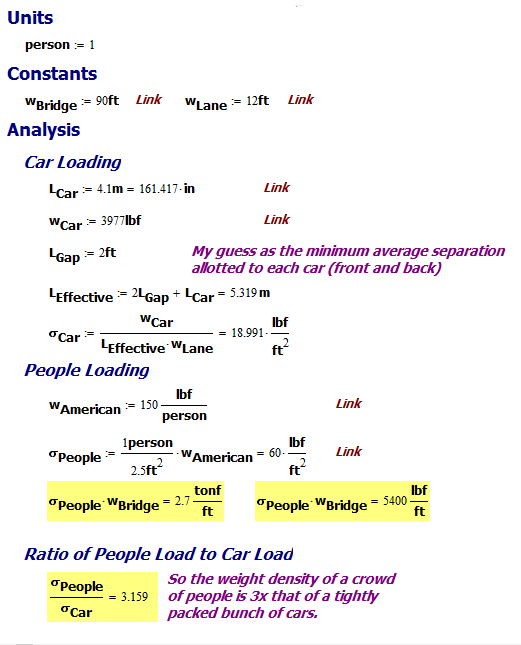
Figure 2: My Analysis of the Bridge Loading.

This analysis tells me two things:

  • The bridge loading for cars is about 1/3 the loading for packed people.
  • My value of 2.7 tons per linear feet of bridge is close to the 2.9 tons per linear feet of bridge stated in the Quora post.
Bridge width Lane Width Average length of a car Average weight of a car Weight of a person Crowd density

Conclusion

Just a quick check on where some numbers from a Quora post. I also was able to determine the loading imposed by a mosh pit-type group of people. I calculated a load of 60 lb per ft2 for a packed crowd, which seems like a lot.

Posted in General Mathematics | Comments Off on Flattening the Golden Gate Bridge Deck

Naked and Afraid Statistics

Quote of the Day

The Soviets are our adversary. Our enemy is the Navy.

Curtis LeMay, General, US Air Force. Anyone who has worked on a US military defense contract knows about interservice rivalry. General LeMay was the prototype for General Turgidson in the movie Dr. Strangelove.


Updated 16-Aug-2017. I added all the episodes to date. I have also began filling in the table with new data like weight loss, military experience, and the type of build the men have. It will take time but I will eventually get all this data filled in.

Introduction

Figure 1: Locations of 2-Person Naked and Afraid Episodes.

Figure 1: Continent Locations of 2-Person
Naked and Afraid Episodes.

I do not watch much reality television, but one show I do watch is Naked and Afraid (N&A). I have always been interested in primitive survival skills (e.g. I have blogged about knot tying and rigging), and this show really puts those skills to the test. I like the fact that the participants are presented with survival challenges from around the world (Figure 1). They have been on all the continents but Antarctica – I could not imagine someone surviving naked in Antarctica for any length of time.

While watching N&A recently, my wife sat down with me and made some observations that I thought I could test. Here were her questions:

  • Are the women younger than the men?

    I had not thought about it until my wife mentioned it, but the women do seem younger than the men.

  • Do the women have lower Primitive Survival Rating (PSR) scores than the men?

    It does seem like the women have lower PSR scores than the men. That may be a function of the women being younger than the men, or the fact that the rubric is heavily weighted toward the kinds of employment that men tend to have.

  • Is the start-to-finish PSR change for men the same as for women?

    My personal feeling is that the women start out lower and end up lower, but this should be easy to test.

I gathered all the data on the participants that I could, which was more difficult than you might think.

Background

Definitions

Primitive Survival Rating (PSR)
A metric for evaluating an individual's level of primitive survival skills on a scale from 1 to 10. The show's producers say about the metric is that it is established by a team of experts who evaluate the participants at the beginning and end of each episode, but they do not provide a rubric for its evaluation. People who regularly watch the show can see that the metric is heavily weighted toward people who regularly practice their survival skills – such as survival educators.

Approach

I gathered all the data into a spreadsheet (here) and imported the data into R. I then used ggplot2 to plot the data. I tend to use box plots, which I find quickly give me a good feel for the distribution of the data.

Analysis

I should comment on notation. Box plots show the median as a dark bar in the "center" of the plot. I also like to include an annotation for the distribution mean, for which I use the symbol μ.

Are the Women Younger Than The Men?

On average, yes (Figure 2) by about 3 years.

Figure 2: Male and Female Age Distributions.

Figure 2: Male and Female Age Distributions.

Do the Men Have Higher PSRs Than the Women?

On average, yes (Figure 3) by about 0.65. This difference seems to maintain from start to finish.

Figure 3: Comparison of Starting and Ending PSRs.

Figure 3: Comparison of Starting and Ending PSRs.

Note that the mean and median for the women are quite different from each other.

Is the Start-To-End PSR Change Same For Men and Women?

The average change is very similar, with women having a wider distribution (Figure 4).

Figure 4: Change in PSR (Start-to-Finish) For Men and Women.

Figure 4: Change in PSR (Start-to-Finish) For Men and Women.

Conclusion

I believe that I have answered my wife's three questions. I do have some questions of my own that I want to address. One question that I have is whether the PSR difference between men and women has any correlation with the fact that the women are younger. This will be a subject for a later post.

Save

Save

Save

Save

Save

Save

Posted in Statistics | 71 Comments

Things Not to Do in an Interview

Quote of the Day

The Lord told me it's flat none of your business.

Jimmy Swaggert, video minister, responding to a question after having been caught for the second time with a prostitute.


I have been in management since 1995, and I literally have hired many dozens of people and interviewed hundreds of people in the process. I have heard just about everything you can imagine in an interview. After a recent interview, I thought it might be useful to mention a few things not to do in an interview:

  • When asked about what you feel is your strength, it probably is best not to respond that "I find that I solve problems in a few minutes that others struggle to solve in days or weeks."

    This just seems way too arrogant. As I have commented before, I have a limit on the prima donnas per square foot that I will tolerate.

  • When asked about what you do in your spare time, it probably is best not to discuss your love of combat knives and how you would use them in practice.

    With all the violence in the workplace, why would someone mention this in an interview?

  • When discussing your previous work experience, it probably is best not to focus on how rotten your previous jobs were and how you hated all your former managers.

    Will any workplace situation make you happy?

  • When you are asked at the end of the interview if you have any questions, it probably is best if every question were not about vacation, sick time, personal time, paternity leave, leave of absence, etc.

    After all, it is a job.

  • When you arrive at the interview, it is probably best not to smell like peppermint schnaps.

    This was kind of funny. The guy came in and started talking, when an engineer walked by and said, "It smells like peppermint schnapps in here." The candidate then took out a breath mint and started sucking on it.

  • When negotiating your salary needs, do not be rude to the HR people – they do not take kindly to this.

    Really … why be rude to anybody? I cannot imagine why someone who got through the entire interview process would then shoot himself in the foot at the very end of the process. I have been told that Google gives everyone who had contact with the interviewee a form to fill out, including drivers. I have always included the input from EVERYONE. You can tell much about the character of a person by how he treats those not in a position to do him any favors. In the end, character is what distinguishes the best employees.

  • When interviewing for a job, it is probably best not to find the work morally repugnant.

    I used to work for a defense contractor, and one interview involved an engineer who turned out to also be a peace activist. Somehow, it completely escaped his attention that the job involved designing weapons – the interview was very short.

  • When interviewing for a job, it is probably best not to list as a reference the manager who just fired you.

    I terminated an employee for improper use of hands in the workplace. Three weeks after I terminated him, I get a call from a friend of mine who was thinking of hiring him. My friend said this person had listed me as a reference.  Really?

In case you are wondering, all of these things actually happened. The only one that really bothered me was the combat knife stuff. Very creepy …

Postscript

I should mention some other things people have done to ruin their chances for a job.

  • When negotiating for a salary, it is best not to constantly change your requirements.

    I give people one cycle of negotiation. Any more cycles cause me to worry about how argumentative the candidate is. We are an engineering organization – not a debating society.

  • While sending a "thank you" letter after an interview is nice, do not use this letter as an opportunity to write a manifesto on your thoughts on the meaning of life or other unrelated topics.

    Yes, I actually had a person that I wanted to hire until I read her extensive manifesto on the meaning of life sent as part of her thank you letter. It just seemed inappropriate and a sign of poor judgement.

  • On your first day of work, do not come in drunk.

    Yes, I actually had a person who passed-out while coming in the door for his first day of work.

Save

Posted in Management | 2 Comments

Product Design vs Research

Quote of the Day

He who is not every day conquering some fear has not learned the secret of life.

- Ralph Waldo Emerson


Introduction

Figure 1: My Formula For Product Development Success.

Figure 1: My Application of
Shockley's Formula to Product
Development.

I saw an interesting discussion on the Dynamic Ecology web site about publishing research papers. As I read the article, I saw that analogies could be drawn between doing research and developing new products. The Dynamic Ecology post was centered on observations made by William Shockley , 1956 Physics Nobel Prize winner, on what makes a successful researcher.

I should point out that while Shockley was a first-class physicist, he was a terribly flawed human being. I first saw him on television while studying late one night while at university. He was on the Tomorrow television program debating a representative of the NAACP on race and eugenics – Shockley should have stuck to physics. If you want to hear him "go off the rails" in a debate, see this Youtube video.

Hurdles to a Successful Research Paper

Shockley proposed a Figure of Merit (FOM) for predicting the likelihood of a scientist producing good research papers based on the product of scores for some key characteristics. While not rigorous, empirical formulas like Shockley's are very common. Their main value is in stimulating discussion on the factors critical to a particular problem. The most famous is probably the Drake Equation, which certainly has stimulated lots of discussion on exoplanets. Another common one is the Taylor KO Factor, which is used by hunters.

The critical factors identified by Shockley, each of which are are graded on a scale from 0 to 1, are:

  • Ability to think of a good problem
  • Ability to work on it
  • Ability to recognize a worthwhile result
  • Ability to make a decision as to when to stop and write up the results
  • Ability to write adequately
  • Ability to profit constructively from criticism
  • Determination to submit the paper to a journal
  • Persistence in making changes (if necessary as a result of journal action).

Hurdles to a Successful Product Development

Following Shockley's lead, I would propose that a similar FOM could be developed to assess the likelihood of an engineering organization to produce successful product designs. My FOM would form the product of the scores for the following characteristics (each score with a range from 0 to 1):

  • Ability to perform the market research needed to identify a product that meets a market need.

    I would argue that most product failures are due to poor market research. Market research shows you what the customers value and how much they are willing to pay for the value your product will provide.

  • Ability to focus resources to work on the product

    There is a minimum level of staffing that you need to complete a product in a timely fashion. There is an increasing amount of popularity for design sprint workshops that takes a lot of resources but will complete the entire design process in just five days. Also, some developments require highly specialized skills – you need specific individuals.

  • Ability to identify the key contribution of this product to the market

    You must make sure the product fills a need in the marketplace. I have seen product developments that did not have a clear vision of their contribution to the market, and these developments tend to produce products with poor market acceptance.

  • Ability to come to a consensus on the minimum viable version of the product

    You have to know when to stop adding features and ship the product – I have seen developments that tried to do too much. We sometimes refer to this as "trying to boil the ocean." In the electronics world, products have a vary narrow time window in which they can enter a market and make a significant contribution. Your competitors are always nipping at your heels.

  • Ability to execute the product design

    Product development teams need to focus on being able to develop competitively priced, reliable products on a predictable schedule. Development teams could employ 3D laser scanning and other technologies to create these products. Before determining how to launch your goods, it's a good idea to look into 3d laser scanning costs.

  • Ability to obtain effective reviews of your product during development

    Product development is a complex process and you never get everything right for your early prototypes. You must get an effective review, both internal and external, to ensure that you have met the market need. This is harder than you might think. I have found it more and more difficult over time to get people to seriously evaluate a product when it is put in front of them – I think most people are too busy or too distracted.

  • Determination to get early customer feedback on your product.

    You must select beta customers that will thoroughly vet your implementation and help you identify what you have missed.

  • Persistence in resolving every issue identified during development, test, and early market evaluations.

    Every single issue must be resolved. The gods of electronics usually give you hints of future problems during development, but only hints. These hints can foretell of enormous problems after general release. You must find the root cause for every issue – even the little ones.

Conclusion

As far as Shockley's formula, I have come to believe that all forms of creative activity are far more alike than they are different. I hope I have shown that the same is true for product development and scientific research.

Posted in Management | 2 Comments

Temperature-Compensated SLA Battery Charging Voltage

Quote of the Day

If the tiger ever stands still the elephant will crush him with his mighty tusks. But the tiger does not stand still. He lurks in the jungle by day and emerges by night. He will leap upon the back of the elephant, tearing huge chunks from his hide, and then he will leap back into the dark jungle. And slowly the elephant will bleed to death.

Ho Chi Minh, who viewed the Vietnam War as a contest between a tiger and an elephant. In a nutshell, this quote explains how the strategy of Ho Chi Minh and General Giap defeated the US.


Introduction

Figure 1: Typical Temperature Compensated Battery Charging Voltages for AGM and gel Lead-Acid Batteries.

Figure 1: Typical Temperature Compensated
Battery Charging Voltages for AGM and gel
Lead-Acid Batteries.

I have had a number of questions at work the last few days on the proper charging voltage for Absorbed Glass Mat (AGM) and gel Sealed Lead Acid (SLA) batteries. I regularly discuss charge profiles with UPS and charger vendors. I grabbed data at random from two good ones and plot the data in Figure 1. One of specifications I used was for gel SLAs and the other was for AGM SLAs.

Both vendors reduce their charging voltage by 3 mV/(cell·°C). The vendors do have a 20 mV difference in absolute level, which I view as a minor difference – both battery construction types should charge just fine using either voltage profile.

For the more equation-oriented among you, Equation 1 shows the formulas behind Figure 1.

Eq. 1 \displaystyle {{V}_{{Gel\ Cell}}}=-0.003\text{ }\frac{\text{V}}{{{}^\circ \text{C}}}\cdot \left( {T-20\text{ }{}^\circ \text{C}} \right)+2.265\text{ V}
\displaystyle {{V}_{{AGM\ Cell}}}=-0.003\text{ }\frac{\text{V}}{{{}^\circ \text{C}}}\cdot \left( {T-20\text{ }{}^\circ \text{C}} \right)+2.285\text{ V}

where

  • VAGM Cell is the cell voltage in V. Note that the difference in voltage between AGM and gel SLAs probably reflects the difference in vendor more than the requirements of the battery construction.
  • VGel Cell is the cell voltage in V.
  • T is battery temperature in °C.

To avoid thermal runaway, there is a temperature above which  charging should be stopped, but I have not seen a consensus on this value – it varies between battery vendors. I commonly see the statement that you should not charge a battery at temperatures above 50 °C , while you can discharge them at temperatures as high 60 °C. You need to consult with the specific battery vendors you are using for their recommendations.

Postscript

Figure 2 shows the charger voltage as a function of battery temperature (Source).

Figure M: Another Vendors Approach to Tempeature Compensation.

Figure 2: Another Vendors Approach to Temperature Compensation.

Posted in Batteries | 3 Comments

CO2 Tonnage Added To Atmosphere Per Year

Quote of the Day

All problems become smaller if you don’t dodge them, but confront them. Touch a thistle timidly, and it pricks you; grasp it boldly, and its spines crumble.

— William S. Halsey


Introduction

Figure 1: NOAA Plot of the Atmosphere's CO2 Concentration.

Figure 1: NOAA Plot of the Atmosphere's CO2 Concentration.

My youngest son told me that I needed to watch the new Cosmos series with Neil deGrasse Tyson. I was immediately hooked – it is a masterpiece of  scientific exposition for a general audience. I thought the original Cosmos with Carl Sagan was excellent, but the progress in computer graphics during the intervening decades makes the program visually stunning.

I was particularly interested in the part of the program that addressed the rise in global CO2 levels. Dr. Tyson stated that 30 billion tons of CO2 are being added to the atmosphere every year from human-related (i.e. anthropogenic) sources. I thought I would try to confirm this tonnage level using Figure 1, which is an atmospheric CO2 level chart from the National Oceanic and Atmospheric Administration (NOAA).

Background

For thousands of years, CO2 levels stayed at ~280 ppm (Figure 2) because the natural mechanisms of CO2 generation have been in equilibrium with the natural mechanisms of CO2 absorption (Source). Figure 2 shows data from both direct measurements and ice cores. Starting in about 1800 CE, this balance was upset and the atmosphere's CO2 level has been rising ever since. The start of rising global CO2 levels and the beginning of the industrial age (~1800 CE) appear to coincide . CO2 levels are now over 400 ppm and are rising at a rate of over 3 ppm per year – and the rate of increase is increasing.

The interesting aspect of Figure 2 is that we can separate out natural sources of CO2 from anthropogenic content by the carbon isotope content ({}_{6}^{{12}}C \text{ vs } {}_{6}^{{13}}C) of the CO2. The burning of organic material releases a much higher proportion of  {}_{6}^{{12}}C \text{ to } {}_{6}^{{13}}C (reference), a proportion that is related to a metric known as δ13C. To understand the δ13C metric, see this Wikipedia article.

Figure M: Natural Vs Human-Related CO2 Generation.

Figure 2: Natural Vs Human-Related CO2 Generation (Source).

According to the USGS, volcanoes release about 250 million tons of  CO2 compared to 35 billion tons of CO2 from anthropogenic sources.

Analysis

Annual CO2 Concentration Rise

2016 started with a level of 404.02 ppm, with the concentration increasing by more than 3 ppm in 2015. I found a table of NOAA data for the annual increase in CO2 levels here. In Figure 3, I plotted the data and fit a linear curve to it. Not only is the CO2 concentration increasing every year, the rate of increase is increasing by 0.00275 ppm/year/year.

Figure 2: Annual CO2 Concentration Increase.

Figure 3: Annual CO2 Concentration Increase.

Annual Atmospheric CO2 Tonnage Increase

Figure 4 shows my rough enough for the tonnage being released into the atmosphere. It is reasonably close to Tyson's "30 billion tons per year" statement. You will notice a unit called "atm" in the analysis – this stands for a sea-level air pressure of 1 atmosphere or 101,335 Pascals.

Figure 4: Annual CO2 Tonnage Put into the Atmosphere.

Figure 4: Annual CO2 Tonnage Put into the Atmosphere.

Molar Mass of Air Molar Mass of Air

My rough calculation shows ~27 billion tons of CO2 per year going into the atmosphere. This is within 10% of Tyson's 30 billion ton figure, so my approximations give results that are pretty close to his figure.

Conclusion

I was able to confirm the statement from Neil deGrasse Tyson that the annual increase in atmospheric CO2 tonnage is ~30 billion tons a year. Since volcanic activity releases ~250 million tons of CO2, the vast majority of the CO2 released into the atmosphere every year is from human sources.

Posted in General Science | 6 Comments

Recent Asteroid Impacts on Mars and Jupiter

Quote of the Day

After the agricultural revolution, human societies grew ever larger and more complex, while the imagined constructs sustaining the social order also became more elaborate. Myths and fictions accustomed people nearly from the moment of birth to think in certain ways, to behave in accordance with certain standards, to want certain things, and to observe certain rules. They thereby created artificial instincts that enabled millions of strangers to cooperate effectively. This network of artificial instincts is called culture.

— Yuval Noah Harari, 'Sapiens: A Brief History of Humankind'. This is the best definition of culture that I have seen.


I liked this picture of the recent impact of a small asteroid on Mars. This impact crater is about 100 feet across and was not seen in NASA photographs prior to 2010 and was first seen in a photograph in 2012. The blue color is an artifact of the image enhancement process, which removed the red dust.

PIA17932-1920x1200Here is a link to the original article.

There also was an asteroid impact reported on Jupiter that was seen by Austrian amateur astronomer  Gerrit Kernbauer on 17-March-2016. Here is the Youtube video, which is a bit rough but still worth a view. Here is a link to an article on this event.

Posted in Astronomy | 5 Comments

A Little Heat Sink Math

Quote of the Day

I know not so many people want to do math, but sometimes it would be easier to clarify many things if you do some math.

— From a WiFi paper on cyclic delay diversity. I cannot imagine designing ANY RF/wireless system without math – it boggles my mind.


Introduction

Figure 1: Common TO-220 Heat Sink.

Figure 1: Common TO-220 Heat Sink.

I am conducting a seminar next week on cooling electronics. One of the topics I will cover involves basic heat sink usage. Most of the products that are designed by my team do not use heat sinks because we are not allowed to use fans in our designs – fan-based cooling systems generally have air filters that require regular maintenance that is unacceptable for optical hardware deep in the network (example deployment).

I shudder every time I think of fans in an outdoor deployment. Adding fans and filters means that you need to add diagnostic hardware to monitor the health of both the fans and their air filters (e.g. sensors to measure fan speed and air flow). Diagnostics are always a mixed blessing;it is nice to know the health of your hardware, but the diagnostics frequently create a false alarm problem. Also, fans have poor reliability compared to electronic parts – moving parts are likely to stop moving. Generally, this means that you have to add redundant fans so that if one fails you have backup capacity. This costs money in terms of initial outlay and operating costs.

However, my group is now working on a number of designs for the central office that do use fans, and it is time that I provide some heat sink usage guidelines for my team. Let's start this exercise with a simple heat sink for a TO-220 transistor (Figure 1). I have used this heat sink many times at my previous companies, and I am very comfortable discussing it.

Background

Definitions

heat sink
A heat sink  is a passive heat exchanger that transfers the heat generated by an electronic or a mechanical device into a coolant fluid in motion. The transferred heat leaves the device with the fluid in motion, therefore allowing the regulation of the device temperature at physically feasible levels (Source).
heat spreader
A heat spreader is a heat exchanger that moves heat between a heat source and a secondary heat exchanger whose surface area and geometry are more favorable than the source. Such a spreader is most often simply a plate made of copper, which has a high thermal conductivity. By definition, heat is "spread out" over this geometry, so that the secondary heat exchanger may be more fully utilized (Source).
This definition defines the heat spreader as an interface between a hot object and the its heat exchanger. In industry, we often use the term "heat spreader" when discussing the use of a heat sink without a fan. This improves the thermal coupling between the integrated circuit being cooled and the air.
Sink-to-Ambient Thermal Resistance (θSA)
θSA is a parameter selected to make the relationship T_{HS} = T_A + P\cdot\theta_{SA} true, where THS is the heat sink temperature, TA is the ambient temperature, and P is the power to be dissipated.

Effect of Moving Air on Heat Sink Performance

The efficiency of a heat sink is strongly related to the air flow across the heat sink. We say that {{\theta }_{{SA}}}\propto \frac{1}{{{{h}_{{Air}}}}}, where hAir is the thermal conductivity of air. Figure 2 shows the thermal conductivity of both still and moving air (Source).

Figure 2: Thermal Conducivity of Air (h) vs ΔTSA (Sink-to-Ambient).

Figure 2: Thermal Conductivity of Air (h) vs  Sink-to-Ambient Temperature (ΔTSA).

Figure 2 tells us several things:

  • h increases with increasing air speed.
  • Since θSA ∝ 1/h, θSA will decrease ⇨ better heat transfer from the sink to the air.
  • θSA is only approximately constant because h increases with increasing ΔTSA.
  • Observe the strong non-linearity in the 0 m/s air speed curve at low ΔTSA.

Heat Sink Specifications

If you want to understand all the nuances of heat sink specifications, read this paper from Aavid. For this post, we are going to focus on this chart for the heat sink in Figure 1 – the call-out bubbles are my annotations.

Figure 3: Specification Graph for Heat Sink of Figure 1.

Figure 3: Specification Graph for Heat Sink of Figure 1.

Analysis

Objective

In Figure 1, the heat sink's θSA is given as 24 Ω. However, if you look at closely Figure 3, you will see that θSA varies with air speed (curve labeled "Moving Air") and θSA is always less than 24 Ω. Where does the 24 Ω value come from? It represents the thermal resistance in still air curve at low power levels, which I will demonstrate below. I also want to determine the thermal resistance for still air at various power levels.

Analysis

Figure 4 show the my analysis, which consists of:

  • Digitizing the still air curve (i.e. ΔTSA vs P) from Figure 3.
  • Interpolating and smoothing my digitized still air curve.
  • Computing {{\theta }_{{SA}}}\left( P \right)=\frac{{d\Delta {{T}_{{SA}}}}}{{dP}}
 Figure 4: Generation of Thermal Resistance for Still Air.


Figure 4: Generation of Thermal Resistance for Still Air.

We can see that θSA varies from ~28 Ω for power dissipations near zero and decreases to ~12 Ω at 5 W. Thus, the 24 Ω value shown in Figure 1 represents the approximate θSA in still air and at low power levels.

Conclusion

I derived the effective thermal resistance of this heat sink in still air for power levels from 0 to 5 W. I was able to show that the 24 Ω value stated in the specification reflects the thermal resistance of the heat sink at low power levels and under still air conditions. The actual thermal resistance is a function of the allowed ΔTSA value and the air speed.

Posted in Electronics | 1 Comment

MTBF, Failure Rate, and Annualized Failure Rate Again

Quote of the Day

The sowing is behind; now is the time to reap. The run has been taken; now is the time to leap. Preparation has been made; now is the time for the venture of the work itself.

— Theologian Karl Barth describing midlife. Some days I think he is right – some days I am not so sure.


Introduction

Figure 1: Relationship Between Failure Rate, MTBF, and Annualized Failure Rate.

Figure 1: Relationship Between Failure Rate,
MTBF, and Annualized Failure Rate.

I just had another meeting where folks thought that specifications for Annualized Failure Rate (AFR), failure rate (λ), and Mean Time Between Failures (MTBF) were three different things – folks, they are mathematically equivalent. I have given up writing the formulas down as a way to explain the concept (like here). Maybe a graphic will illustrate the relationship better? I have tried this approach before – the most successful was about component temperatures. That graphic has saved me hours trying to explain how temperature limits are specified in hardware.

Figure 1 is my attempt at showing the equivalence of these three specifications. This graphic assumes that the units of these specifications are fixed with

  • MTBF is in hours.
  • λ is in failures per 1E9 hours (AKA FIT)
  • AFR is in % per year.

Figure 2 shows a worked example.

Figure 2: Example of the Calculations Illustrated in Figure 1.

Figure 2: Example of the Calculations Illustrated in Figure 1.

I should mention that many computer algebra systems have the ability to handle any units you choose. Figure 3 shows an example from Mathcad.

Figure 3: Example Calculation Using Mathcad's Unit System.

Figure 3: Example Calculation Using Mathcad's Unit System.

You will note that the answers in Figure 3 are slightly different than in Figure 2. This is because Mathcad defines a year as 365.242… days. The formulas in Figure 2 assume 365 days in a year, which is a common assumption in reliability work.

Posted in Electronics | 2 Comments

Unfortunate Satellite Launch Problem Allows Test of Relativistic Time Dilation

Quote of the Day

Happy families are all alike; every unhappy family is unhappy in its own way.

— Leo Tolstoy from 'Anna Karenina'. This quote is the basis of the Anna Karenina Principle, which describes an endeavor in which a deficiency in any one of a number of factors dooms it to failure. Consequently, a successful endeavor (subject to this principle) is one where every possible deficiency has been avoided.


Introduction

Figure 1: Galileo Navigation Satellite.

Figure 1: Galileo Navigation Satellite (Source).

In November 2015, the European Space Agency (ESA) had a launch problem with two of its Galileo navigational satellites that resulted in both satellites being placed into highly elliptical orbits. ESA can burn some of the satellites' station-keeping fuel to bring these orbits back to standard, but this will take some time. While the orbit adjustments are occurring, ESA will use the satellites to provide another test of Einstein's general theory of relativity. Specifically, they will test the prediction that clocks will run slower the closer they approach a massive object.

I read about this experiment in an article in The Register. Normally, I would not comment on an article like this one; however, this article had an error in it that bothered me. The article states that an earlier test of general relativity measured a rather large clock rate increase:

Gravity Probe A found that a clock 10,000 kilometers up ran 140 parts in a million of a second faster than the same device on Earth, but it was a one-shot mission.

This number could not possibly be correct. I deal with precision clock sources every day – typically Stratum 1 level, and a clock variation of 140 ppm would be easily visible using standard watches. If my watch were running 140 ppm fast, that would mean that it would run 12 seconds fast every day – I would notice an effect this large very quickly. The effects of general relativity are very real, but are much more subtle. I thought I would determine what the article should have reported.

I believe what the article's author intended to say was that the Gravity Probe A experiment verified general relativity to a precision of ±70 ppm, which is what the project quoted in its original report.

Background

Gravity Probe A Time Dilation Result

I found a reference to the time dilation measured by Gravity Probe A in the book Splitting The Second: The Story of Atomic Time (ISBN 9781420033496). Here is a quote from this book.

But the most spectacular confinnation of the gravitational shift came in June 1976, when a NASA spacecraft called Gravity Probe A was launched on a rocket to a height of I0 000 kilometres before falling back to Earth. The probe carried a hydrogen maser clock constructed by physicists Roben Vessot and Martin Levine at the Smithsonian Astrophysical Observatory. As usual, two relativistic effects were operating: time dilation due to the speed of the rocket and the gravitational shift due to the height above sea level. By monitoring the speed of the rocket throughout the 2-hour flight. the physicists were able to separate out the two effects and show that at the maximum height the gravitational shift was causing the clock to run fast by four parts in 1010. as predicted by general relativity. The agreement was within 70 parts in a million.

If you want to read more about time dilation, I have included a reference to this book in this post's Appendix A.

My Previous Writing on This Subject

I went into detail on the clock shifts associated with GPS satellites in this post. The same math is used here.

Analysis

The calculation of the time dilation due to a satellites position in a gravity field is straightforward and shown in Figure 2. I show a time dilation of about 4 parts per 1010, as expected.

Figure 2: Quick Calculation of the Time Dilation due to General Relativity.

Figure 2: Quick Calculation of the Time Dilation due to General Relativity.

Conclusion

I find errors in newspaper and magazine articles all the time. Normally, I just ignore them. However, this one bugged me because it seemed so far off, and it is on a topic that I work with every day.

I should comment that some publications are excellent at making corrections. I found an error in New York Times article a few years ago and sent a note to the author. He corrected the online version within a few hours.

Appendix A: Test Reference

This excerpt is from the book Splitting The Second: The Story of Atomic Time, which I quoted in the post.

Posted in Astronomy, Navigation | Comments Off on Unfortunate Satellite Launch Problem Allows Test of Relativistic Time Dilation