Quote of the Day
There are two ways to do great mathematics. The first is to be smarter than everybody else. The second way is to be stupider than everybody else -- but persistent.
— Raoul Bott, Hungarian-American mathematician. His first way is not an option for me, so I will need to focus on his second way.
Introduction

Figure 1: Experience Curve for the Ford Model T (Source).
I frequently am asked by marketing and finance people about how component costs will vary with time. Their motivations are clear – most market segments are strongly driven by unit cost, and the marketing folks need to determine when costs will drop enough to enlarge the Total Addressable Market (TAM) for their products.
I use experience curves, which are sometimes called learning curves. These curves are described using Wright's law, which states that product cost decreases as a power law of cumulative production. Like of all of these empirical "laws", it really is more of a "rule of thumb" than a law. T.P. Wright first published his law in an article on airplane production back in 1936, but it has been found to apply in many industries (Figures 1 and 2).

Figure 2: Photovoltaic Experience Curve (Source).
Recently, I saw a magazine article that compared five commonly used costing models, one of which was Wright's law. The article stated that Wright's law was somewhat better than its closest competitor, Moore's law, which states that product costs decrease as a power law of time.
In this post, I will:
- discuss how I use Wright's law to model product cost.
- present some normalized cost data from actual fiber optics equipment.
Background
Wright's Law
Wright stated that the average time needed to produce a component will reduce as you build more of the components. Specially, the average build time need for a component after building N units will decrease by a fixed fraction after you have built 2· N units. We can state his law as shown in Equation 1.
| Eq. 1 |
 |
where
- n is the cumulative number of units built.
- t1 is time need to manufacture the first unit of the product.
- tn is time need to manufacture the nth unit of the product.
- K is the percentage of the time required to build the 2·ith product relative to the ith product. This fraction is assumed to be constant regardless of the value of i.
While Wright was focused on the time needed to build nth component relative to the first one, it has been found that his rule also holds true for product cost, i.e. 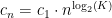 , where cn is the cost of the nth unit and c1 is the cost of the first unit. In the discussion to follow, we will be focused on the variation in unit product cost versus cumulative production and time.
Analysis
Objective
The objective of this analysis it to develop a standard approach for predicting product cost versus time.
Logistic Curve
Applying Wright's law means that we need a model for the cumulative production of a product. The logistic curve (Figure 3) is the most commonly used analytic model of the cumulative production of a product. Figure 2 can be thought of as representing the fraction of cumulative production completed at time t assuming time is referenced to the 50% level.

Figure 3: Standard Logistic Curve (Source).
For practical applications, it is useful to scale the time access to represent common units of time (e.g. months, quarters, years) and different "ramp rates" – the slope of the center portion of the curve. Equation 2 shows the functional form scaled and slope-adjusted logistic curve.
| Eq. 2 |
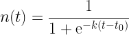 |
where
- k is a scaling parameter that is a function of the "ramp" time of the component .
- t is the specific time (usually quarter) that the component is purchased.
- τ is time-shift needed so that t=0 corresponds to the time when we begin purchasing the component.
- n(t) is the percentage of cumulative production completed at time = t. I usually referred to n(t) as the normalized production.
Cost Modeling
Wright modeled the cost of an item using Equation 3, which uses the cost of the first item (c0) as its reference value.
| Eq. 3 |
 |
where
- c(n) is the cost of the nth item produced.
- c1 is cost of the 1st item.
Because I would only rarely know value of c1, I will modify Equation 3 so that I use the cost at any level of production to determine my curve. In Equation 4, I assume that I can compute solve for c1 assuming that I know the unit cost after n(t=0) have been built. I refer to this cost as c(n(0)). This allows me to restate Equation 3 as a follows.
| Eq. 4 |
![\displaystyle c\left[ {n\left( 0 \right)} \right]={{c}_{0}}\cdot {{\left[ {n\left( 0 \right)} \right]}^{{{{{\log }}_{2}}\left( K \right)}}}](https://s0.wp.com/latex.php?latex=%5Cdisplaystyle+c%5Cleft%5B+%7Bn%5Cleft%28+0+%5Cright%29%7D+%5Cright%5D%3D%7B%7Bc%7D_%7B0%7D%7D%5Ccdot+%7B%7B%5Cleft%5B+%7Bn%5Cleft%28+0+%5Cright%29%7D+%5Cright%5D%7D%5E%7B%7B%7B%7B%7B%5Clog+%7D%7D_%7B2%7D%7D%5Cleft%28+K+%5Cright%29%7D%7D%7D&bg=ffffff&fg=000&s=1&c=20201002) |
|
![\displaystyle c(n)=\frac{{c\left[ {n\left( 0 \right)} \right]}}{{{{{\left[ {n\left( 0 \right)} \right]}}^{{{{{\log }}_{2}}\left( K \right)}}}}}\cdot {{\left[ {n\left( t \right)} \right]}^{{{{{\log }}_{2}}\left( K \right)}}}=c\left[ {n\left( 0 \right)} \right]\cdot {{\left( {\frac{{n\left( t \right)}}{{n\left( 0 \right)}}} \right)}^{{{{{\log }}_{2}}\left( K \right)}}}](https://s0.wp.com/latex.php?latex=%5Cdisplaystyle+c%28n%29%3D%5Cfrac%7B%7Bc%5Cleft%5B+%7Bn%5Cleft%28+0+%5Cright%29%7D+%5Cright%5D%7D%7D%7B%7B%7B%7B%7B%5Cleft%5B+%7Bn%5Cleft%28+0+%5Cright%29%7D+%5Cright%5D%7D%7D%5E%7B%7B%7B%7B%7B%5Clog+%7D%7D_%7B2%7D%7D%5Cleft%28+K+%5Cright%29%7D%7D%7D%7D%7D%5Ccdot+%7B%7B%5Cleft%5B+%7Bn%5Cleft%28+t+%5Cright%29%7D+%5Cright%5D%7D%5E%7B%7B%7B%7B%7B%5Clog+%7D%7D_%7B2%7D%7D%5Cleft%28+K+%5Cright%29%7D%7D%7D%3Dc%5Cleft%5B+%7Bn%5Cleft%28+0+%5Cright%29%7D+%5Cright%5D%5Ccdot+%7B%7B%5Cleft%28+%7B%5Cfrac%7B%7Bn%5Cleft%28+t+%5Cright%29%7D%7D%7B%7Bn%5Cleft%28+0+%5Cright%29%7D%7D%7D+%5Cright%29%7D%5E%7B%7B%7B%7B%7B%5Clog+%7D%7D_%7B2%7D%7D%5Cleft%28+K+%5Cright%29%7D%7D%7D&bg=ffffff&fg=000&s=1&c=20201002) |
Combined Law
Shifted and Scaled Logistic Curve
To apply Wright's law, I need to determine the specific logistic curve for our component. This means that I must determine:
- τ, the time-shift parameter that will make t=0 the time we begin buying the component.
- k, the ramp rate parameter of the logistic curve.
We can compute k and τ as functions of (1) the 10%-to-90% rise time of the cumulative production curve (∆T), and (2) the normalized production rate at t=0, n(0). I often have to estimate ∆T based on my personal experience because I do not have direct access to the total volumes a manufacturer is producing. However, I do usually know the total size and annual shipments into my market, so I roughly know both ∆T and n(t). Figure 4 shows how to derive values for both τ and k given ∆T and n(t).

Figure 4: Derivation of Scaled and Time-Shifted Logistic Curve.
The complete set of formulas for the scaled and shifted logistic curve are shown in Equation 4.
| Eq. 4 |
 |
|
 |
Integrating the Logistic Curve with Cost Function
Equation 5 shows the result of integrating Equations 4 and Equation 3.
| Eq. 5 |
 |
To illustrate the use of Equation 5, I show the agreement between Equation 5 and a real fiber-optic transceiver in Figure 5, where I show the normalized price (i.e. cost versus time relative to the initial cost). The agreement is reasonable considering that Wright's law is really a rule of thumb. I originally estimate the parameters of the model (K, n(0), ΔT ) based on my experience with a similar part that we first purchased years ago.

Figure 5: Normalized Fiber Optic Transceiver Cost Versus Time and Overall Production.
Conclusion
I am in the middle of some cost projection work right now. Hopefully, this post will help some of you with your cost projection tasks.


 is the heat of formation for H2O at STP.
 is the heat of formation for CO2 at STP.


 .
.
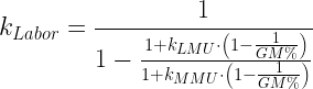
 ), which is usually the case. This means that I will have the greatest GM% when I have a job that is 100% labor.


