
Quote of the Day
Ants individually do not show much intelligence, but in colonies show great intelligence. Humans have exactly the opposite characteristic.
— Scientist discussing ants.
Introduction

Figure 1: Illustration of Component Tolerance
Contributing to Overall Variation (Source).
Electrical engineers design their circuits to work under "worst case" conditions. This means that the circuits will meet their operational requirements when built with any possible mix of components and environmental conditions (Figure 1). Determining the worst case conditions for a complex system can be difficult, especially for analog systems. There are numerous approaches to worst-case circuit analysis. One approach that I use is called Extreme Value Analysis (EVA).
EVA entails evaluating your circuit's performance using every possible combination of extreme component value. This post will show my results for a simple circuit that I needed to evaluate last week. The circuit was designed years ago and the original circuit designer is no longer around – he left years ago to pursue a job writing software for another company.
Background
This circuit measures the DC current generated by an Amplitude-Modulated, Vestigial Sideband (AM-VSB) signal that is shining on a reversed-biased photodiode. The DC current is linearly related to the average optical power being received. The average optical power level is used by software to adjust the overall gain of the system.
Analysis
Circuit
I need to determine the worst-case output voltage range for the circuit shown in Figure 2 when the photodiode exposed to a light level of 6.00 dBm ± 0.35 dBm.
The circuit and its function are really very simple:
- The DC photodiode current enters on the left-side of the circuit.
- An opamp configured as a non-inverting amplifier is used to generate a voltage that is proportional to the DC current level.
- This voltage is fed to an A/D converter (not shown) that will convert the voltage to a number, which can then be used by the software folks.

Figure 2: Circuit For Measuring DC Optical Power.
Algorithm
Figure 3 shows my algorithm for trying all combinations of extreme component values. The algorithm works as follows:
- Generate a binary number with each bit representing a component that will be varied.
- Convert the binary number from "1" and "0" values to "1" and "-1" values.
- Use the "1" and "-1" values to generate the high or low extreme component values. In this case, I will multiply "1" or "-1" by the percentage tolerance. I will then use this tolerance to compute an appropriate component value.
- Compute the circuit's output voltage using the extreme component values selected.
- Repeat for all binary combinations.
- Select the minimum and maximum output voltage values.

Figure 3: Algorithm For Trying All Extreme Values.
Results
Figure 4 shows the results of my analysis. Note that the units are in volts, but I did not use units in this analysis because Mathcad 15 does not allow mixed units in arrays.

Figure 4: Analysis Results.
Conclusion
For this design, 1.05 is called the Design Worst-Case Max and 0.881 is called the Design Worst-Case Min. In addition to these numbers, also performed a Monte Carlo analysis and compared my results with what our Manufacturing team had measured on 3,479 units. Figure 5 shows these results using a box plot. On this plot, I also show what the specification allows for this value. As you would expect, the design worst case values are within the specification limits. However, the Manufacturing spread does show some units outside of the specification range. These units failed the test and needed to be repaired.
Notice how the measured distribution is not as wide as my Monte Carlo distribution. This is because I used a uniform probability distribution for generating my Monte Carlo values. The actual part distributions tend to be closer to a normal distribution.
The red diamonds indicate outliers as defined I defined in my plotting program (1.5 x IQR).

Figure 5: Circuit Output Results.

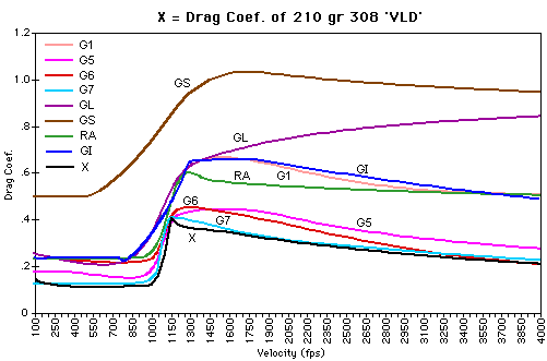


 , where PF is the


