Quote of the Day
The two things that make leaders stupid are envy and sex.
- Lyndon Johnson
Introduction

Figure 1: Example of a Compact Thermal Model. (Source)
I am an electrical engineer and not a mechanical engineer, which means that if there was a choice of buying equipment parts on sites such as Octopart or calling in a professional, the first option may seem reasonable.
As such, I depend on electronic packaging professionals to provide me answers to my thermal questions at work. However, I am curious about how the packaging folks estimate the temperatures of my parts because it affects how my team designs products. This blog post documents my early self-education on how the thermal analysis of electronic components is performed. With a rounded understanding of thermal state change (materials changing from solids to liquids etc) we can better understand how different metals will perform as conductors. Their level of conductivity and energy lost through heat are important considerations before completing a deep thermal analysis of how electronic components perform. This blog post could help answer the question, What Are The Best Modern Wiring Materials? With their thermal thresholds taken into consideration, this post will provide insight into the most effective materials needed to efficiently work with electronic components. For all of your electrical product needs check out MOFSET.
After some explanatory setup, I will work through an interesting example that will estimate a thermal characteristic, known as ?JT, for a part based on its mechanical characteristics.
Background
Temperature Definitions
Note that when I refer to component temperatures, there are generally three temperatures that I worry about it: (1) ambient temperature, (2) junction temperature, and (3) case temperature. In practice, I tend to use ambient temperature and junction temperature the most. Case temperature is usually important when you have heat sinks attached to the component case. I am not allowed to use fans in my outdoor designs because fans are relatively unreliable and require maintenance (e.g. MTBF ? 10K hours under rugged conditions plus the need for regular filter changes). This means that my parts have to convectively cool themselves. I do use case temperature for certain indoor optical products, which often need heat sinks and forced air flow (i.e. fans).
- Junction temperature
- Junction temperature is the highest temperature of the actual semiconductor in an electronic device (Source).
- Case temperature
- The temperature of the outside of a semiconductor device's case. It is normally measured on the top of the case.
- Ambient temperature
- The temperature of the air that surrounds an electronic part. It often measured a defined distance away from a printed circuit board (e.g. 2 inches).
Why Do We Care About Component Junction Temperature?
There are four reasons why people care about the junction temperature of their semiconductors. Let's examine each of these reasons in detail.
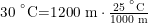
Reason 1: Part Are Specified for Standard Ambient Operating Temperature Ranges
All parts have operating temperature limits and the part manufacturers will only stand by their parts if they are used at these ambient temperatures. The temperature limits are usually expressed in terms of one of the three standard ambient temperature operating ranges:
- Commercial grade: 0 °C to 70 °C
- Industrial grade: ?40 °C to 85 °C
- Military grade: ?55 °C to 125 °C
Reason 2: Many Vendors Impose Special Component Temperature Limits
Many vendors impose a specific temperature limit on their semiconductor dice (e.g. the dreaded Xilinx 100 °C junction temperature limit). I have seen various junction temperature limits used: 110 °C, 120 °C, and 135 °C.
Reason 3: The Reliability of Components Varies with Temperature
The reliability of most electronic products is dominated by the reliability of the semiconductors in those products. Temperature is a key parameter affecting semiconductor reliability because many semiconductor failure modes are accelerated by higher temperatures. Semiconductor failure modes are tied to chemical reactions and the rate of a chemical reaction increases exponentially with temperature according to the Arrhenius equation. I have written about this dependence in a number of previous posts (e.g. here and here).
Reason 4: Company Standards and Practices
I frequently have had to conform to some government or corporate-imposed junction temperature limit. For example, Navy contracts set a junction temperature limit of 110 °C based on the reliability guidelines developed by Willis Willhouby. HP, Honeywell, and ATK all had similar temperature limits, but I cannot remember them all -- yes, I must be getting senile.
Types of Thermal Models
There are two common types of thermal models: detailed and compact. Detailed thermal models use mathematical representations of the objects under analysis that look very similar to the objects they represent. They usually use some form of finite element approach to generate their solutions. These software toys are expensive (e.g. Flotherm and Icepak). We use this type of model at my company ? very good and very expensive. Detailed thermal models are analogous to an electrical engineer's distributed parameter model.
Compact thermal models generally use some form of electrical component analog for thermal parameters. These electrical analogs do not look anything like the mechanical components they represent. Compact thermal models are not as accurate as a detailed thermal model, but they are computationally very efficient (i.e. fast) and the tools required are more readily available (e.g. spreadsheets, Mathcad, etc). Compact thermal models are analogous to an electrical engineer's lumped parameter model.
Thermal Resistances
The electrical engineering concepts of resistance, capacitance, and inductance are powerful in modeling because these components can be used as electrical analogs to anything that can modeled with a linear differential equation. The list of things that can be modeled with linear differential equations is long and important. For this post, we are only discussing thermal resistances. Circuits composed only of resistors do not have any variation with time. However, we can model thermal time variation by using capacitances and inductances. The following quote from the Wikipedia nicely states the thermal and electrical correspondences.
The heat flow can be modeled by analogy to an electrical circuit where heat flow is represented by current, temperatures are represented by voltages, heat sources are represented by constant current sources, absolute thermal resistances are represented by resistors and thermal capacitances by capacitors.
There are three thermal resistances that we encounter regularly: ?JA, ?JC, and ?JB. Let's discuss them in more detail.
- ?JA
- ?JA is the thermal resistance from the junction to the ambient environment, measured in units of °C/W. Ambient temperature plays the same role for a thermal engineer as ground does for an electrical engineer -- it is a reference level that is assumed to be fixed. Because ?JA depends on so many variables -- package, board construction, airflow, radiation -- it is measured on a JEDEC- specified, test PCB. ?JA may be the most misused of all the thermal parameter because people apply to it to PCBs that are completely different than the JEDEC test PCB. The only use for ?JA is for comparing the relative thermal merits of different packages, which is what JEDEC states in the following quote.
The intent of Theta-JA measurements is solely for a thermal performance comparison of one package to another in a standardized environment. This methodology is not meant to and will not predict the performance of a package in an application-specific environment.
- ?JC
- The junction-to-case thermal resistance measures the ability of a device to dissipate heat from the surface of the die to the top or bottom surface of the package (e.g. often labeled with names like ?JCtop or ?JCbot). It is most often used for packages used with external heat sinks and applies to situations where all or nearly all of the heat is dissipated through the surface in consideration. The test method for ?JC is the Top Cold Plate Method. In this test, the bottom of the printed circuit board is insulated and a fixed-temperature cold plate is clamped against the top of the component, forcing nearly all of the heat from the die through the top of the package (Figure 2).
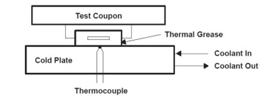
Figure 2: Theta-JC Test Fixture.
- ?JB
- ?JB is junction-to-board thermal resistance. From a measurement standpoint, ?JB is measured near pin 1 of the package (~ 1mm from the package edge) . ?JB is a function of both the package and the board because the heat must travel through the bottom of the package and through the board to the test point (Figure 3). The measurement requires a special test fixture that forces all the heat through the board (Source).

Figure 3: Theta-JB Test Fixture.
Thermal Characteristics
By analogy with an electrical resistor, the temperature drop across a thermal resistor is directly proportional to the heat flow through the thermal resistor. This not the case with the thermal characterization parameters. Because they are not resistor analogs, they cannot be used like a resistor for modeling purposes. However, they do allow an engineer to estimate the junction temperature of a component based on total power usage of a device, but only for the specific circuit conditions under which the parameter was determined.
Let's review the thermal characteristics in a bit more detail.
- ?JT
- Junction-to-top thermal characteristic, is a measure of the junction temperature of a component as a function of the component top temperature, TT, and the power dissipated by the component, PComponent. ?JT is not a thermal resistance because its measurement includes thermal paths outside of the junction-to-board path. ?JT can be used to estimate junction temperature based on the equation
 .
.
- ?JB
- Junction-to-Board thermal characteristic, is a measure of the junction temperature of a component as a function of the board temperature below the component, TB , and the power dissipated by the component, PComponent. ?JB is not a thermal resistance because its measurement includes thermal paths outside of the junction-to-board path. ?JB can be used to estimate junction temperature based on the equation
 .
.
Analysis
The following analysis will discuss an approximation for ?JT from Electronics Cooling Magazine, which did not include a derivation of the approximation. I include a derivation here. I also added an application example using three SSOPs and a chart that shows that the approximation works well for TQFP packages.
An Approximate Expression for ?JT
I find ?JT the most useful of the thermal parameters because it allows me to estimate junction temperature using the case temperature, which I can easily measure. However, most electronic component vendors do not specify ?JT. As I will show below, ?JT for molded plastic parts is closely related to ?JA, which is almost always specified. As I mentioned earlier, I do not find ?JA useful for estimating a part's junction temperature, but it is useful for comparing the relative thermal performance of different electronic packages.
Approximation Derivation
Equation 1 shows an approximation for ?JT that I find interesting and useful.
| Eq. 1 |
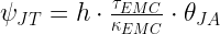 |
where
- ?JT is the thermal characterization parameter for the junction to top-of-case temperature
- h is the heat transfer coefficient for air under still conditions.
- ?EMC is thickness of the Epoxy Molding Compound (EMC)
- ?EMC is the thermal conductivity of the EMC.
Figure 4 shows my derivation of Equation 1, which I first saw in a couple of articles in Electronics Cooling Magazine.

Figure 4: Derivation of an Approximate Expression for Psi-JT.
Empirical Verification
I always like to look for empirical verification of any theoretical expression I deal with. There are a couple of ways I can verify the accuracy of this expression.
- I can calculate estimates for ?JT using Equation 1 and compare my results to a measured value.
This assumes that I can come up with accurate estimates for h, kEMC, and ?EMC.
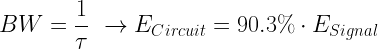
- Since ?JT is linear with respect to ?JA in the same package family, I can graph measured values for ?JT and ?JA and the plot should be linear.
This assumes that h, kEMC, ?EMC are equal between all packages in the same family. This means that I can plot ?JT versus ?JA and I should get a straight line.
?JT Estimate Based on Mechanical Dimensions
Since TI has the best packaging data I can find, I will use Equation 1 to make a prediction of the ?JT for a TI package based on its material and mechanical properties. I have arbitrarily chosen an SSOP-type package for my example (Figure 5 shows the mechanical drawing).

Figure 5: Mechanical Drawing for TI SSOP Package.
I obtained the ?JT and ?JA from this document. I found values for h and ?EMC in an Electronics Cooling Magazine article. Assuming this information is correct, my calculations are shown in Figure 6. The results are reasonable given that we are using an approximation.

Figure 6: Comparison of Measured and Predicted Psi-JT's for SSOP Packages.
Graphical Look At The Relationship Between ?JT and ?JA
Table 1 shows data from this TI document on the thermal performance of their packages.
Table 1: List of TQFP ?JT and ?JA
|
Pkg Type
|
Pin Count
|
Pkg Designator
|
?JA
|
? JT
|
|
TQFP
|
128
|
PNP
|
48.39
|
0.248
|
|
TQFP
|
100
|
PZP
|
49.17
|
0.252
|
|
TQFP
|
64
|
PBP
|
52.21
|
0.267
|
|
TQFP
|
80
|
PFP
|
57.75
|
0.297
|
|
TQFP
|
64
|
PAP
|
75.83
|
0.347
|
|
TQFP
|
52
|
PGP
|
77.15
|
0.353
|
|
TQFP
|
48
|
PHP
|
108.71
|
0.511
|
Figure 7 shows a scatter chart of the data from Table 1. Note how the plot is quite linear with a slope of 0.004184, which means that ?JT is much smaller than ?JA.

Figure 7: Graph of Psi-JT Versus Theta-JA a TQFP Family.
In Figure 8, I use Equation 1 to estimate what this slope should be by assuming all members of this packaging family have the same thickness of epoxy molding compound on top of the integrated circuit.

Figure 8: Estimating the Slope of the ?JT versus ?JA Line.
As we can see in Figure 8, Equation 1 provided a reasonable approximation for the slope of the line in Figure 7.
Conclusion
My goal was to learn a bit about compact thermal models and how they are used. This post provides the background information that I will need for some later posts on the subject. I was also able to confirm that an approximation for ?JT based on mechanical packaging information is probably a useful tool when useful vendor thermal specifications are missing – a distressingly common occurrence.


 is the diameter of the thread [cm].
 is the density of the fiber material [gm/cm3].


 , where m is the mass of the animal in question.