Introduction
I have a project that I am working on that involves the use of conformal mappings. I have long found the use of complex numbers in electrical engineering interesting. My first contact with an engineering application of conformal mappings occurred over 30 years ago when I was working at Hewlett-Packard in Ft. Collins, CO (now an Avago facility). At that time, I saw an article in one of the engineering trade journals (EDN, I think) that used conformal mapping to create a matching network for a telephone hybrid. This article gave me some ideas on how I could use complex variables in my work, and I thought it might be useful to review it here. Unfortunately, my copy of the article is not great and does not include the publication date and the journal name. I include a copy of the article here. This article is very similar to an application note from National Semiconductor by the same author.
I thought it would be worthwhile reviewing this article here. While designing a telephone hybrid is not often done today, the basic problem solving approach can be applied to other electronic problems. As was common back in the 1980s, the article includes the source for a BASIC program that can be used to numerically solve the problem. I will focus, instead, on solving the problem using a computer algebra program (Mathcad).
This article review will provide a nice demonstration of a number of items:
- Simple application of complex numbers in an electrical engineering application.
- Use of the properties of a conformal mapping in an optimization problems.
- Application of a computer algebra system (Mathcad) in computing optimal component values.
Background
Basic Telephone Engineering
Here are the telephone basics you need to know to understand this discussion:
- One line of telephone service is delivered to a home over a single pair of wires (2 wires total).
- The phone line (one wire pair) must carry signals in both directions -- to and from the home.
- Inside the phone there are actually two wire pairs (4 wires total) -- one for the handset microphone and the other for the handset speaker.
- The interface between the 2 wire pairs in the handset and the one wire pair feeding the phone is called a hybrid. It performs a function called 2 wire-to-4 wire conversion.
Definitions
- 2-wire/4-wire conversion
- Inside your phone, the microphone (aka. transmit) and speaker (aka. receive) signals are carried by separate wire pairs. However, only a single wire pair comes to your home -- that wire pair simultaneously carries the transmit and receive signals. Today, the operation of combining and separating the transmit and receiver signals is often done digitally. However, historically this function has been done by an analog circuit called a hybrid. Much woe has been attributed to the lowly hybrid. For example, many of the echo problems people experience are due to a bad hybrid somewhere in the system.
- Hybrid
- A device that transforms a 4-wire phone circuit (1 transmit wire pair and 1 receive wire pair) into a 2-wire phone circuit (transmit and receive signals on a single wire pair). Since the phone line coming to our home carries both transmit and receive signals, we will drive our phone's speaker with this combined signal minus our transmit signal. It turns out we can perform this subtraction very accurately digitally, but historically it has been done by an analog circuit that has frequency-dependent errors. To be completely accurate, we generally like to let a bit of our own transmit signal "leak" into our receive path because it sounds more pleasant. This leakage is referred to as sidetone. We will not worry about sidetone in this blog post.
- Data Access Arrangement (DAA)
- A circuit designed to interface safely to a standard, single wire-pair phone line. It usually contains a transformer and surge protection circuits.
- Line Impedance
- The wire pair that enters your home (i.e. phone line or line) has an impedance that varies based on a number of factors (wire gauge, length, loads, etc). We generally assume the line impedance to be 600 Ω (real), but this is a very crude working assumption. It actually varies significantly, yet we expect our phones to work acceptably no matter where we plug them in. This post is about how to minimize the phone's performance variation with line impedance. If you want to understand the 600 Ω from a bit more theoretical standpoint, see this excellent discussion.
- Conformal Mapping
- A mathematical mapping that transforms circles to circles and straight lines to straight lines.
Problem Statement
Figure 1 shows the circuit that we will be discussing here.
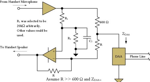
Figure 1: Schematic of the Hybrid Circuit Under Consideration.
Given this circuit, the basic problem statement is simple.
Select component values for R1, R2 and C2 in the circuit of Figure 1 that will minimize the maximum amount of transmit signal that will "leak" onto the receive wire pair.
Approach
The basic approach is simple.
- For a given range of phone line impedances, find the input impedance of the DAA.
We will draw a circle around the range of line impedances that we want to ensure good phone operation. Because the DAA transfer function is a conformal mapping, this circular region of phone line impedances will translate to a circular region of DAA impedances.
- For a given range of DAA impedances and an assumed gain between the transmit amplifier and the receive amplifier, compute the overall gain from the transmit amplifier to the receive amplifier.
The gain between the transmit amplifier to the receive amplifier is the system parameter we are concerned with minimizing. Figure 4 illustrates how this calculation is performed. In this case, we are minimizing the circuit gain and are not considering components at all.
- Vary the assumed amplifier gain until we find the gain that minimized the transmit gain to receive gain value.
This is the gain that we want to ensure that its maximum value is as small as we can make it.
- Compute the component values required to generate the minimum transmit-to-receiver gain.
This is a simple algebra problem.
Analysis
Range of Phone Line Impedances
Figures 2 and 3 show the range of phone line impedances at 1 kHz and 3 kHz (respectively) we will be working. These figures contain the following information:
- The filled irregularly shaped regions represent the range of phone line impedances and how often we expect to encounter them. Three levels of occurrence frequency are represented: (dark blue) very common, (white) moderate occurrence, and (light blue) rarely occur.
- The red axis were inserted by me in Dagra, a program that I use to digitize graphic data. I used Dagra to help me position the purple impedance circles.
- The purple circles mark the range of impedances that my Mathcad routine will be minimizing the transmit-to-receive path gain.
 Figure 2: Phone Line Impedance Likelihoods at 1 kHz. |
 Figure 3: Phone Line Impedance Likelihoods at 3 kHz. |
Mapping from Line Impedance to DAA Impedance
In the article, the author actually measures the DAA impedances when it is attached to three impedances that equal the three phone line impedances that we used to define our circular region of phone line impedances. All we need to do is convert the line phone line impedances to resistor and capacitor values that will generate the equal impedance values at the chosen frequency. I generate the phone line equivalent impedances using the component values computed in Figure 4.
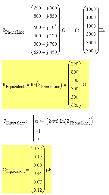
Figure 4: Passive Components Required to Generate Equivalent Phone Line Impedances.
These resistor and capacitor value combinations are connected to the DAA as phone line impedance simulators.
Mapping from DAA Impedance to Gain Values
Rather than working with component values directly, we can model the system using a transmit-to-receive path transfer function A(j·ω). We can then determine the complex gain at specific frequencies that we require to minimize the transmit-to-receive path gain. Figure 5 shows the circuit model for this approach.
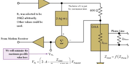
Figure 5: Block Diagram of the Hybrid Circuit Using a Gain Model.
We will find the value of A(j·ω) at specific frequencies that will minimize the transmit-to-receive path gain using Equation 1.
| Eq. 1 |
 |
where
- A(j·w) is the complex transformation applied to the transmit signal (unitless)
- ZDAA is the impedance of the DAA (Ω), which is a function of frequency and the phone line impedance (ZPhoneLine).
Finding Optimum Gain and Computing the Associated Component Values
Figure 6 is an excerpt from the article that shows how the maximum gain for a given set of DAA impedances is computed. We are just computing the magnitude of the largest complex gain we can generate.

Figure 6: Geometric View of Determining Maximum Gain.
For details on how I compute the center point and radius of the circle generated by the three gain point, see Appendix A.
Once we have the maximum gain computed, we can compute the component values that will minimize this gain. Figure 7 shows how I derived equations for the passive component values as a function of the complex gain A(j·ω).

Figure 7: Develop of Equations to Solve for Passive Component Values.
Figure 8 shows the calculation of the specific component values.

Figure 8: Determination of Specific Component Values for the Hybrid.ues
Conclusion
I reworked the example from this paper using Mathcad and have duplicated the paper's original results. I will be using a routine very similar to this one to solve an actual problem that I am working on right now.
Appendix A: Circle Parameters from Three Points
Figure 9 show my derivation of the equations for computing the center coordinates and radius of a circle given three points on the circumference.

Figure 9: Determine a Circle's Center and Radius Using 3 Points.


 as representing the percentage of time represented by a differential length of profile time. As in the discrete case, you can view this as the computing of a weighted average.

 , where ρ is my estimate of the average density of an asteroid (2.46 gm/cm3)