Quote of the Day
You must have long term goals to keep you from being frustrated by short term failures.
— Charles C. Noble
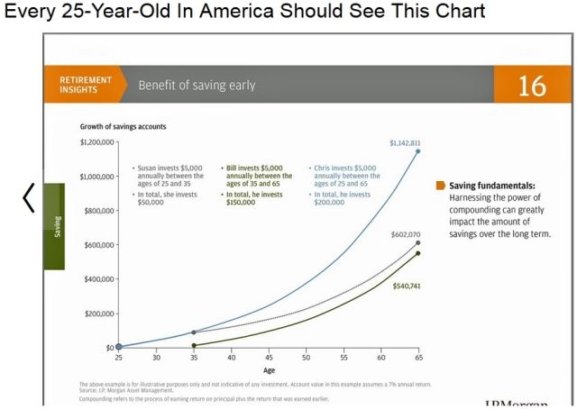
I was reading this article on the importance of young people understanding compound interest. The meat of the article is this graphic from JP Morgan (Figure 1). I do plan on discussing this graph with one of my sons this weekend.
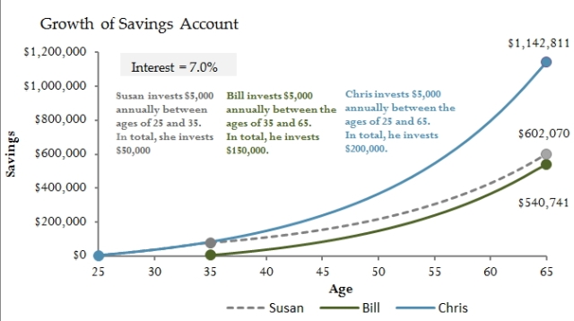
Since I am always looking for good examples to use for training folks in the use of Excel, I thought I would generate my version of this chart using Excel. Here is what I came up with – I modified the format just a bit because I was not totally happy with how JP Morgan did it. Also, I wanted the assumed interest rate to be programmable and I wanted to be able to modify the yearly contributions. I guess I cannot leave anything alone.
I have attached my Excel workbook for generating this chart.


