I have always imagined that paradise will be a kind of library.
— Jorge Luis Borges. I understand this feeling – I still love being in a library.
Introduction
Figure 1: Sound Pressure Level versus Frequency and Perceived Sound Level (Wikipedia).
I have received a number questions lately on the use of log and antilog taper potentiometers. Because of these questions, I thought it might be useful to review why these tapers are used.
These tapers are primarily used with audio systems. While I am not an audio aficionado, I do appreciate controls that vary linearly, i.e. a small rotation of the knob makes a correspondingly small change in an output. The log and antilog taper potentiometers are used to ensure that audio systems controls have linear characteristics as perceived by the human ear.
Background
Definitions
phon
The phon is a unit that is related to dB by the psychophysically measured frequency response of the ear. At 1 kHz, readings in phons and dB are, by definition, the same. For all other frequencies, the phon scale is determined by the results of experiments in which volunteers were asked to adjust the loudness of a signal at a given frequency until they judged its loudness to equal that of a 1 kHz signal (source).
Sound Pressure Level (SPL)
Sound pressure or acoustic pressure is the local pressure deviation from the ambient (average, or equilibrium) atmospheric pressure, caused by a sound wave. In air, sound pressure can be measured using a microphone, and in water with a hydrophone. The Pascal (Pa) is the SI unit of sound pressure (source).
Overview
Understanding Figure 1 is the key to understanding the role of the log and antilog tapers in potentiometers. The phon scale is intended to give you a perceived loudness scale that is linear, i.e. a 20 phon level that increases to 40 phon will be perceived as twice as loud. Looking closely at Figure 1, we can see that a 20 phon level @ 1 kHz increase in corresponds to a 20 dB increase in SPL. Another way to view this relationship is to say that an increase of one phon increases the SPL by 1 dB or 12.2 % – SPL must increase geometrically to increase the perceived sound level linearly.
Analysis
Assumptions
The speaker drive voltage is proportional to the resistance of the potentiometer.
The speaker output power is proportional to the square of the speaker drive voltage.
The SPL level in Pascals (not dB) is proportional to the square root of the output power, i.e. sound power is proportional to the square of the pressure.
The percentage of the full-scale resistance will be expressed in terms of the percentage of full-scale wiper position.
For my example here, I will use the W taper potentiometer discussed in this post. I will slightly change the resistance characteristic derived previously to eliminate the constant I added to ensure the resistance was 0% of full-scale at 0% wiper position. This will give me an ideal antilog characteristic, i.e.
Calculations
Resistance Range in dB
Figure 2 shows how the dynamic range of our ideal antilog potentiometer, which is 29 dB.
Figure 3 shows that our perceived sound level (in phons) varies linearly with our ideal exponential potentiometer's wiper position. I have also include how the performance of a potentiometer with an ideal antilog taper differs from that of a typical, real, antilog taper potentiometer.
Figure 3: Phon Variation with Wiper Position. Observe how the dynamic range of the sound level equals the dynamic range of the potentiometer.
Conclusion
This is just a quick note to illustrate why an antilog taper can be useful in giving an audio system a linear perceived sound level with potentiometer wiper position.
There are two worthwhile videos on this topic on Youtube. Here is a very good video that shows the difference in sound from a guitar using a linear versus a log/antilog potentiometer.
Here is a video that illustrates how to measure the resistance characteristic of a log/antilog potentiometer.
When you repeat a mistake it is not a mistake anymore: it is a decision.
— Paulo Coelho
Introduction
Figure 1: Strait of Gibraltar and the Mediterranean.
In an effort to get some exercise, I walk every night, even in the middle of winter. To keep my mind occupied while walking, I listen to audio books. One of my favorite audio books is titled The Earth: A Very Short Introduction (link). This book provides an excellent overview of basic geophysics. It is not a book about rocks, but rather a book about the structure of the Earth.
This book contains an excellent discussion of the Mediterranean's periodic drying episodes that are collectively known as the Messinian Event, which occurred five million years ago during the Miocene era. There is one quote from the book that caught my ear:
In the 1970s the ocean drilling programme came to the Mediterranean. There, the drill cores reveal something sensational. I was shown one of them where it is now stored at the Lamont Doherty Geological Observatory of Columbia University in New York. It consists of layer after layer of white crystalline material, a material of salt (sodium chloride) and anhydrite (calcium sulphate). These evaporite layers can only been formed by the Mediterranean drying up. Even today, evaporation rates are so high that, were the Straits of Gibraltar sealed off, the entire Mediterranean would evaporate in about 1,000 years. The implication of the hundreds of metres of evaporite in the drill cores are that this must have happened perhaps 40 times between 5 and 6.5 million years ago. When the scientists drilled close to the strait of Gibraltar, they encountered a chaotic mixture of boulders and debris. This must have been the giant plunge pool of the world's greatest waterfall, when the Atlantic broke through past Gibraltar to refill the Mediterranean. We can only imagine the roar, the spray, the power of the water.
I find the whole idea of the Mediterranean drying up multiple times in a relatively short time amazing. Let's take a closer look at this statement.
Background
We need a few pieces of information to work this problem.
The average depth of the Mediterranean is 1500 m (link)
The area of the Mediterranean is 2.5 million square km (link)
The Mediterranean would lose 140 cm to 188 cm of depth every year without replenishment from external source (see Appendix A for sources and a theoretical estimate in Appendix C)
The Mediterranean's evaporation losses are only partially compensated for by rainfall and rivers (see quote below) − the replenishment ratio estimates appear to range from 25% to 75% of the evaporation rate. The key point is that the difference during the Miocene era was made up by the water flowing through the Strait of Gibraltar (see Appendix B). When the Strait of Gibraltar closed during that time, the Mediterranean had negative net water flow and it dried up.
I arbitrarily chose 188 cm/year for my water evaporation rate.
Analysis
Figure 2 shows my analysis. I looked at the rate evaporation time with and without rain or river water contributions.
Figure 2: Mediterranean Drying Time Calculations.
Conclusion
I was able to confirm that the drying time is about one thousand years.
I recall reading something about the Mediterranean having dried up back when I was in grade school. The reading quoted a Russian geologist working on the Aswan High Dam in Egypt. He said that there were geological signs near the dam that indicated that there once was a waterfall near the mouth of the Nile during the Miocene era. This would be consistent with the Mediterranean being dry.
Appendix A: Quotes on Mediterranean Drying
The following quote from the book Environmental Condition of the Mediterranean Sea: European Community Countries (link).
On account of the climate and virtual enclosure of the Mediterranean, the temperature of Mediterranean water, except for the surface layer, does not fall below 13 °C, even in winter (Figure 1.4). The water of the sea is therefore subject to a very high evaporation (140 cm per year), compensated only for 75% by rainfall and river inflows (UNEP/WG. 171/3, 1987). The evaporation rate varies over the entire area. In the Aegean, Sea, the Adriatic Sea and the Ligurian Sea, the evaporation balance is zero whereas a high evaporation rate is found in the eastern Mediterranean, the Gulf of Sirte and in the central western Mediterranean.
I found numerous references to the one thousand year drying time on the web. Here is another example (citation at the bottom of the quote).
"Only the inflow of Atlantic water maintains the present Mediterranean level. When that was shut off sometime between 6.5 to 6 MYBP, net evaporative loss set in at the rate of around 3,300 cubic kilometers yearly. At that rate, the 3.7 million cubic kilometres of water in the basin would dry up in scarcely more than a thousand years, leaving an extensive layer of salt some tens of meters thick and raising global sea level about 12 meters." Cloud, P. (1988). Oasis in space. Earth history from the beginning, New York: W.W. Norton & Co. Inc., 440. ISBN 0-393-01952-7
The following quote from the book Can Squid Fly (ISBN 1408151308) contains the following useful passage.
Did the Mediterranean really dry up once?
Yes, about 6 million years ago; and in the unlikely event that the Strait of Gibraltar became blocked up, the Mediterranean would dry out again in a matter of a thousand years or so.
The reason is that the Mediterranean is a strange and interesting, sea, with a very curious water budget – that is, the balance between the incoming and outgoing water. The sea was formed about 20 million ago when the African tectonic plate collided with the Eurasian plate, enclosing a great expanse of sea between them. First, the eastern end closed up when present-day Arabia collided with what became Turkey and Iran, leaving the Persian Gulf between them. What is now the Red Sea was already in existence between Arabia and north-eastern Africa, but there was no connection with the eastern Mediterranean. Some time later, the western end closed and the drying out process began because the water balance situation was, if anything, even more extreme than it is today.
The modern Mediterranean has a total surface are of about 2.5 million km2 (1 million square miles) and a mean depth of 1500 m (5000 ft). This gives it a volume of about 3.75 million km3 (900,000 cubic miles). The annual water loss by evaporation from its surface is about 4,700 km2 (1,130 cubic miles). About 1,200 km3 (300 cubic miles) falls back as rain each year, but the Mediterranean has few major rivers apart from the Rhone, the Nile, and via the Black Sea, the Danube. Consequently, the total annual supply from all river sources is only about 250 km3 (60 cubic miles), leaving a net annual deficit of some 3,250 km3 (770 cubic miles). This deficit is made nowadays made up by the Atlantic water entering the Mediterranean in the form of a strong and almost continuous-eastward-flowing surface current through the Strait of Gibraltar. In fact this input is so large that there is a smaller, but very significant, outward flow of the Mediterranean water the surface current.
This quote indirectly indicates that the evaporation rate is 188 cm/yr. Figure 3 illustrates the calculation.
Figure 3: Derivation of 188 cm/yr evaporation loss.
Appendix B: Flow Through Strait of Gibraltar
The Environmental Condition of the Mediterranean Sea (ISBN 9401581770) contains the following paragraph that lists the water flow through the Strait of Gibraltar.
The water input into the Mediterranean from run-off is 455E9 m3 per year while the net input through the Strait of Gibraltar amounts to 2500E9 m3 per year. Of the 154E9 m3 drawn off and used per year, 72% is used for irrigation, 10% for drinking water and 16% for industries (including thermal power stations) not linked to the domestic supply. The 4 EC countries account for 61.6% of the freshwater supply and 57.5% of the freshwater demand.
Appendix C: Theoretical Prediction of Evaporation Rate
Figure 4 shows how you can use Hargreaves' formula to estimate the evaporation rate from the Mediterranean. I made the best estimates I could for some of the parameters required by the formula.
For a much more detailed discussion on predicting evaporation rates, see this document.
Figure 4: Estimate of the Nominal Evaporation Rate of the Mediterranean Using Hargreaves' Formula.
Yesterday, I had a question from a reader on how to develop mathematical formulas for different potentiometer tapers. Normally, I would simply answer the questioner without a separate post, but my solution for this particular question provided a nice illustration of basic coordinate transformations. Since I have not shown any coordinate transformation applications in this blog before, I thought it would be worthwhile to make a post of my response.
There many different names (e.g. "M", "W", "S") assigned to the common potentiometer tapers. To my knowledge, the taper names vary by vendor. For this post, I will use the taper names as stated in Figure 1 by State Electronics, which the questioner referred to. My work here will focus on the M and W tapers, which are closely related.
My analysis assumes that the potentiometer taper is an actual exponential curve. For ease of manufacture, many potentiometer suppliers approximate the exponential curve using a piecewise linear approximation. For example, Figure 1 shows a W taper that appears to be composed of three linear segments.
I should also mention that I add a constant term to my exponential function to allow my curve fit to pass through zero, which is what happens with real potentiometers – a true exponential curve, i.e. , would not pass through zero.
Background
Potentiometer Construction
This discussion will focus on the common, three-terminal potentiometer. Figure 2(a) shows how State Electronics defines the terminals and Figure 2(b) shows what a potentiometer looks like inside.
Figure 2(a): Terminal Definitions.
Figure 2(b): Physical Construction of a Three-Terminal Potentiometer (source).
W Taper
The W taper is sometimes referred to as the antilog taper because it related to the exponential function. Its specific functional form of the potentiometer resistance between terminals 1 and 2 is dictated by the following definition.
The “W” taper attains 20% resistance value at 50% of
clockwise rotation (left-hand).
I should mention that you rarely see the W taper described in terms of an actual function – it resistance versus wiper position is almost always shown as a graph. Remember that these are physical parts and they vary quite a bit from their nominal specifications.
M Taper
The M taper has a sigmoid shape and its resistance between terminals 1 and 2 is defined in terms of the W taper as follow.
The “M” taper is such that a “W” taper is attained from
either the 1 or 3 terminal to the center of the element.
Analysis
W-Taper Characteristic
Figure 3 shows my approach to developing a W taper functional relationship.
Figure 3: W Taper Resistance Between Terminals 1 and 2.
M-Taper Characteristic
Figure 4 shows my approach to developing an M taper functional relationship.
Figure 4: M Taper Functional Relationship Between Terminals 1 and 2.
Figure 5 shows my combined plot of the M and W tapers. They are very similar to that shown in Figure 1.
Figure 5: Plot of My Functions for the M and W Tapers.
Conclusion
This post demonstrated how to develop functional relationships for the resistance of two common types of potentiometer tapers. It does seem odd that these functions are never actually stated in the vendor documentation, but hopefully I have alleviated that shortcoming here.
The worldwide demand for cars will not exceed one million –even if just for a scarcity of available chauffeurs.
— Gottlieb Daimler, Inventor, 1901. Early cars were so complex that chauffeurs were considered mandatory. Most technology becomes more user-friendly over time – cars were no exception.
Introduction
Figure 1: Coal Trains Are A Common Sight Where I Live. (Source)
I drive a short distance (7 km) to work everyday. On my drive, I often have to wait at a railroad crossing for a coal-train train to pass (typical example in Figure 1). I have never thought much how much my state depends on coal until I saw an interview with a Missouri senator who was talking about her state's dependence on coal for electrical power generation. I am currently teaching myself how to use the Power Query add-in for Excel, and I thought that generating a graphic of coal dependence by state would be a good Power Query/Visio exercise.
Background
I found the 2013 state-by-state percentage of coal-based electrical generation at this web site. I used Power Query to gather the data and clean it up. I then used a data connection to Visio to load the data into a map of the US. The process worked very well.
Analysis
The analysis was all done in Power Query and involved scraping data from a web site. The rest of the work was linking my Excel workbook to a Visio drawing of the United States – something I do all the time. This allowed me to generate the following plot of the percentage of coal-based electrical generation by state (Figure 2).
I was surprised by the widely varying percentages of coal usage –0% to 95%. This zip file contains the files I used to create this graphic. To use the files, you will have to update the data connection link to reflect where you put the files.
Save
Posted inGeneral Science, software|Comments Off on Electricity Generation Percentage from Coal By State
— Paul Samuelson's PhD adviser to the rest of Paul's dissertation committee after his thesis defense. Samuelson, arguably the greatest economist of his generation, was intimidating to his professors even as a student.
Introduction
Figure 1: Image of Human Red Blood Cells (Source).
I regularly visit the RefDesk website to pick up general information. Refdesk has a section that contains a Fact of the Day from the Random History website. Unfortunately, these "facts" are occasionally just plain wrong (example). Today, another one of these random facts did not seem correct and I thought I would perform a quick Fermi analysis here to show that it cannot be correct. I assume that they confused hours and minutes in their analysis. I will present my argument below.
The questionable random "Fact of the Day" is a simple one.
Every hour, about 180 million newly formed red blood cells enter the bloodstream. Red blood cells are basically shells. Before being released from the bone marrow, most of a red blood cell's internal structure is ejected, creating a disc-shaped balloon that is ideal for carrying oxygen and a small amount of the body's carbon dioxide.
A rough mental calculation told me that this number was way too small. I will perform a more detailed calculation below that supports my argument that this number is low by a factor of ~60. Did they really mean to say one minute instead of one hour? That is my theory.
Analysis
Figure 2 shows my detailed calculations with links that support each result.
Figure 2: My Calculations for the Average Number of Blood Cells Lost Per Minute.
Conclusion
My calculations show that ~180 million red blood cells are replaced every minute – not ~180 million every hour as stated in the "Fact of the Day."
Loyalty to a petrified opinion never yet broke a chain or freed a human soul.
— Mark Twain
Introduction
Figure 1: Solar Viewing Angle as Seen From the Planets.
I enjoy collecting and occasionally creating pins for my Pinterest collection. There was one pin that I saw (Figure 1) that I thought would be a good exercise to use when I conduct training classes in Visio and Excel. This post will use a simple Excel table of planetary orbit data to drive the creation of similar graphic in Visio. I will make one change to the information contained in Figure 1 – I will add Pluto because I still like to think of it as a planet. I will also remove the black background because I find black a bit harsh for a background color.
I regularly use Excel to drive Visio drawings. For example, I often handout a graphic of the United States that shows the average cost of a kiloWatt (kW) of electricity for each state. This is useful for customers who want to know how much operating a piece of electronic gear is going to cost them in annual electricity charges.
Background
The only background material required is a table of the mean orbital radii of the nine planets.
Figure 2: Screenshot of My Excel Table of Mean Planetary Orbit Radii (Source).
The table was constructed using US customary units because the first table I found was in US customary units.
All files used here are attached at the bottom of the post.
Analysis
Approach
My approach was simple:
I copied the data from the source web page to an Excel workbook.
I computed the relative angular diameter of the Sun from each planet and put that data into a column. I set the largest circle diameter equal to 10 inches and scaled the rest proportionally.
I saved workbook.
I opened a Visio workbook and created a drawing with nine circles.
I linked the Excel table to the Visio workbook.
I linked each circle to a relative angular diameter.
I then arranged the circles in a pattern similar to Figure 1.
Results
Figure 3 shows my Visio results. It looks reasonably similar to Figure 1.
Figure 3: My Version of the Angular Diameter Figure.
Conclusion
This will be a nice exercise to use in my training classes.
In my many years I have come to a conclusion that one useless man is a shame, two is a law firm, and three or more is a congress.
— John Adams
Introduction
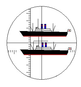
Figure 1: Example of the View of a Target Using a Submarine Periscope's Stadimeter.
Recently, I was reading about stadiametric range finding methods being used by hunters and their telescopic sights – I was surprised to find a lot of writing on the topic. As I researched the topic, I saw that there are three common approaches used in telescopic sights: milliradian (mil), Minute Of Angle (MOA), and Inch Of Angle (IOA). I will review these methods here.
My interest in these methods comes from my addiction to a video game, Silent Hunter, which is an excellent simulation of submarine warfare during WW2. Periscopes contain a built-in stadimeter (Figure 1) that was used to measure the angular height of a target ship. If the target ship's height could be obtained from nautical reference manuals, the range to the target ship could be computed using the formula .
Background
The following Youtube video (Figure 2) does a nice job of reviewing the calculation mechanics of stadiametric range determination using a telescopic sight. However, it does not derive the formulas that are used. I will derive these formulas in the Analysis portion of this post.
Figure 2: Good Youtube Video on stadiametric Distance Measurement.
As an engineer, I view all three methods as variations on the same theme. However, the topic is a subject for some debate because stadiametric ranging using these sights is one of the few areas where people still routinely do arithmetic in their head. If you are a person who likes to work with inches, the arithmetic may be simpler for the MOA and IOA methods because of some useful measurement coincidences. If you work in the metric system, you may find the milliradian approach has simpler math. It all depends on how your brain is wired.
Analysis
Milliradian (Mil)
The milliradian (mil) is an approach that can be used regardless of the unit of measure. It is based on the use of radian unit, which is the standard unit of angular measure in the mathematical world. Figure 3 shows how to derive the distance subtended by one mil at 100 yards and the range at which 1 inch is subtended by a mil.
On a personal note, the mil is actually the first unit of angular measure that I learned as boy. My dad was an old US Army artilleryman and he liked to use these units. Don't get me started on the differences between the different definitions of mil – so many definitions and so little difference.
Figure 3: Deriving Important Mil-Radian Relationships.
We can determine the range of a 12-inch target with a circular measure of 1.6 mils as shown in Figure 4.
Figure 4: Mil Application Example.
True Minute of Angle
Figure 5 shows that a minute of angle subtends an arc of 1.0472 inches at 100 yards or 1.00 inches at 95.5 yards . Most people approximate both of these relationships as 1 inch at 100 yards. For accurate ranging at long distance, you need to account for the 4.7% of error.
Figure 5: Derivation of Minute of Angle Relationships.
To illustrate how to use a telescopic sight with minute-of-angle graduations, consider the case where we have a 12-inch objects that subtends 1.6 MOA in the sight. We can compute the range of this object as shown in Figure 6.
Figure 6: MOA Application Example.
Shooter's Minute of Angle (SMOA) or Inch of Angle (IOA)
In actual fact, you can define a circular angle in any number of ways. A small number of telescopic sights define the circular angle in terms of the angle subtended by 1 inch at 100 yards (Figure 7). This makes the math very simple for those who like to think in terms of inches.
Figure 7: Example Using an Inch of Angle.
I will again work an example (Figure 8) that assumes a 12-inch target but that now subtends 1.6 IOA.
Figure 8: IOA Application Example.
Conclusion
I was amazed at the number of forum posts on this topic that I encountered. At a fundamental level, these approaches are all mathematically equivalent. It really comes down to what is more comfortable for the individual. If your mind is really into customary units like inches, the IOA/SMOA seems like the best. The mil-radian approach is unit-independent and that has its attractions. I am unclear as to why anyone would want to use the true MOA approach, however, some reticles are not available in the IOA format and you may have no choice.
The longer I work in IT the more I realize Excel is the duck tape of the enterprise.
— Tweet about Excel that I believe.
Introduction
Figure 1: Fiber-To-The-Premises Plant Model (Source).
I recently was asked to explain how a Fiber-To-The-Premises (FTTP) system measures the length of fiber between the central office and each residence in the network (Figure 1). This is an interesting question and I thought it would be worthwhile to the describe the measurement process here.
Service providers are interested in the length of their fiber runs because this information is useful in maintaining their fiber optic infrastructure. For example, a common maintenance situation would involve a home where the data service has become unreliable and the service degradation needs to be investigated. My first questions in these cases are (1) how much total signal attenuation is on the fiber, and (2) how long is the fiber run to the residence. I ask these two questions because the most common issue that I uncover is too much attenuation or distance on the fiber, which is usually caused by
dirty fiber connector or bad splice
These are, by far, the most commonly encountered problems. One common scenario involves a backhoe accidentally cutting a fiber, which means a new fiber must be spliced in. These repairs are often difficult to make cleanly.
fiber plant design error
These errors usually are accidental.
fiber length outside of specification
RF video lasers only meet their quality of service requirements over a given length of fiber
There are dispersion-induced distortions that will occur in analog system.
extra fiber length adds fiber loss, which may exceed the system budget
on very long fiber runs, you can see dispersion problems
Low-levels of dispersion will behave like excess fiber loss.
There can be many other sources of trouble, but I begin my troubleshooting by looking for excessive attenuation or fiber length – these are the most common sources of trouble, and they are usually easy to find.
My focus in this post will be on fiber length determination for Gigabit Passive Optical Network (GPON) systems. Other Passive Optical Network (PON) technologies, like EPON, work similarly.
Background
Overview
In a PON, data is transferred between a Central Office (CO) and multiple destinations (called Optical Network Terminals [ONTs]) that are at different distances. In these networks, each ONT will see all the data sent from the CO on the PON, with each ONT assigned a fraction of the CO's transmit time. This means that the ONTs can "pick off" the portion of the data stream that it has been assigned as all the data comes to it.
The situation for transferring data from the ONTs to the CO is more complex. The data must arrive at the CO in a defined order, but each ONT is at a different range. This means that the ONTs must transmit at a time chosen to compensate for the transmission time differences caused by the distance variations. This post is about how this compensation value is chosen.
Glossary
Central Office (CO)
The CO is the aggregation point for all the data from the residences. The CO will typically have many fiber connections, with each fiber connection serving as many 64 homes. Each home can be different ranges. To be strictly accurate, I should use the term Optical Line Terminal (OLT) instead of CO, however, the acronym CO will be more familiar to the general reader.
Optical Network Terminal (ONT)
Each home will have an ONT, which communicates with the CO and converts the optical signal into Ethernet for distribution within the home.
Downstream (DS)
Downstream describes communication from the CO to the ONT.
Upstream (US)
Upstream describes communication from the ONT to the CO.
Round-Trip Time (τRTT)
The time it takes for data to be sent from the CO down to an ONT. and for the ONT's response to be received by the CO.
Flight Time (τFlight)
The time that an optical signal takes to move from the ONT to the CO or from the CO to the ONT.
Response Time (τResponse)
Each ONT is given a fixed time to process downstream information from the CO before it needs to transmit data back.
Data Frame
To ensure that every ONT gets an opportunity to transmit on a regular basis, data transmission is broken up into frames of 125 μs (i.e. an 8 kHz rate). This means that each ONT gets an opportunity to transmit every 125 μs. To eliminate the possibility of interference, each ONT is assigned a time "slot" within the data frame. The length of the time slot varies with their data needs. I always view the data frame as being like a train with groups of cars assigned to each ONT. It is very important that the ONT data is arranged in the order that the CO expects.
Start Time (NStart)
An ONT's assigned upstream time slot within a data packet. Technically, start "time" is actually a 16-byte increment (NQ) within a data frame. This increment can be converted to a time by using the data rate (RUS) and increment with the formula .
Equalization Delay (τEqD)
Every ONT is assigned an Equalization Delay (τEqD), which is based on on the ONT's range from the CO. The function of the equalization delay can be viewed several ways. My viewpoint is that each ONT must delay its transmission by τEqD + τStart to ensure that its data arrives back at the CO in the correct position within the data frame. This means that ONTs near the CO have a longer τEqD than ONTs far from the CO. Each ONT must transmit its photons at exactly the correct time to ensure they all arrive at the CO in the correct order. A τEqD is assigned to each ONT during a process called ranging, which I will not be discussing in this post.
Since every ONT is sharing access to the fiber, they are each assigned a time "slot" in which to talk to the CO. To ensure that every ONT knows when to send data upstream, the CO periodically sends a "start of frame" signal downstream to all the ONTs. This start of frame signal is used to synchronize the transmissions from the ONTs.
System Architecture
For the purposes of this post, here is what you need to know about a TDM FTTP system:
The ONTs are all assigned equalization delays that will make them respond with the same timing as an ONT at the maximum fiber range.
A "start of frame" message is sent down regularly to synchronize their clocks.
The CO can measure the round-trip time for sending down a packet and receiving a response.
The ONTs have a specific amount of time that they are allowed to process a data request.
The CO knows the round-trip time, the ONT processing time, and the equalization delay.
Distance Calculation
Most engineering calculations have a "bookkeeping" aspect to them and determining the length of a fiber optic cable is no exception. We will determine the fiber distance by measuring the time required to send data from the CO to the ONT and for the ONT to respond back. Equation 1 is the key relationship, which basically says that distance equals rate (speed of light) multiplied by time.
Eq. 1
where
cFiber is the speed of light on the fiber. I discuss the nuances of this calculation in Appendix A.
τ Flight is time required for the signal to travel from CO to the ONT, or from the ONT to the CO. Technically, the two times are different because the speed of light varies with wavelength on a fiber, but the speeds are so close that I assume them to be equal.
dFiber is the fiber distance.
Analysis
Bookkeeping
Figure 2 shows the delays that make up the round-trip time, which is what the CO can measure. The CO knows every number shown in Figure 2 but the flight time – and we have two flight times, CO→ONT and ONT→CO.
With a little algebra, we can compute the flight time.
Figure 2: Delays that must be accounted for.
Distance Formula
The distance formula is derived in Figure 3.
Figure 3: Derivation of Distance Equation.
The parenthetical term in the highlighted equation is the flight time. We can compute the constant factor (cFiber/2) as shown in Figure 4.
Figure 4: Calculate the Speed of Light on the Fiber.
Example Calculation
Figure 5 shows an example calculation.
Figure 5: Fiber Length Calculation Example.
Conclusion
This question has come up before and it is now time to write down the answer in detail. It provides a nice illustration of the myriad bookkeeping details associated with what is a very simple concept. Remember – all this to estimate a distance using the grade-school formula distance equal rate multiplied by time.
The discussion above uses my notation. Here is an excerpt from the GPON specification that gives the official formula. It is the same formula, just notationally different.
Figure 6: Fiber Distance Formula from the NGPON2 Specification.
where
FDi is the fiber distance for the ith ONT.
RTTi is the round-trip time measured when communicating with ith ONT.
EqDi is the equalization time assigned to the ith ONT.
RspTimei is the response time of the ith ONT.
StartTime is the number of bits within the data frame at which the ith ONT begins to respond. This variable also should have an i subscript, but they forgot it.
Rnom is the bit rate of the upstream transmission.
Appendix A: Speed of Light on a Fiber
Equation 2 is used to model the speed of light on the fiber.
Eq. 2
where
nFiber(λ) is the fiber's index of refraction, which is a function of wavelength.
cFiber is the speed of light on the fiber.
c is the speed of light in a vacuum.
The fiber's index of refraction as a function of wavelength is given by Figure 7.
The whole point of being a citizen soldier is that you cannot wait until you are no longer a soldier.
— Gary Gallagher
Introduction
Figure 1: Front Armor Angle on Sherman is Angled at 56°.
When I was a boy, most of the fathers in my neighborhood had served in WW2. One of these fathers, Alvin Weese, was an Army veteran who was very specific about his WW2 service by saying that he had "served under Patton" and you could clearly see his pride in having been a soldier in Patton's 3rd Army.
As a boy, Alvin's comments about "Old Blood and Guts" got me curious about the American use of armor during WW2. Most of what I read or heard was quite disparaging (example) about the M4 Sherman Tank (Figure 1).
The comments I heard about the M4 can be summarized as:
caught fire too easily
inadequate armor
inadequate main gun
the M4 should have been replaced earlier by the M26 Pershing.
This weekend, I saw a Youtube video by a gentleman, with the handle "The Chieftain", who works for wargaming.net as a researcher and he had a completely different take on the M4 Sherman than I had heard before. While he addressed each of the concerns that I listed above, in this post I will limit my focus to his statement that the sloped frontal armor on the M4 Sherman was actually comparable to the unsloped frontal armor of a Tiger I. Specifically, he states that the Sherman had an equivalent frontal armor thickness of 3.6 inches compared to that of a Tiger I's 4.4 inches (see the video below, about 34 minutes in).
Since the Sherman is listed as having 2 inches of frontal armor, I thought it would be interesting to examine his statement more closely to understand the reasoning behind the 3.6 inch statement. In response to an excellent response from a reader of my blog, I will also look at how the armor was constructed and how a Sherman's armor had a much more difficult attack to resist than the Tiger I did.
We can thank the gaming community for bringing so many of these facts about WW2 weapons into light.
Background
Video That Motivated This Post
Figure 2 shows the Youtube video that got me thinking. The lecturer does an exceptional job describing the complex managerial context of US armored forces during WW2.
Figure 2: Good Lecture on American Armor During WW2.
Definitions
Cast Homogeneous Armor
As the name states, cast armor is formed in a mold. As such, it allows for high-rates of production. Unfortunately, cast armor provides less protection than an equivalent thickness of rolled armor.
Rolled Homogeneous Armor
As the name states, rolled armor is formed through a rolling process. This process generally provides protection superior to that of an equivalent thickness of cast armor.
Armor Overmatch
This is a complex topic, but as the diameter of a shell nears the thickness of the armor, the armor provides less protection than you would predict based on its thickness. I have not been able to find a definitive description of overmatch, but it appears to be related to shock. There are many online discussions on how to model this effect (example). The Sherman, with 2 inches (50 mm) of frontal armor, was overmatched against 75 mm and 88 mm armor.
Line of Sight Thickness (τLOS)
The horizontal thickness of a tank's armor, which increases as the armor is sloped (see Figure 2).
Normal Thickness (τN)
The thickness of a tank's armor normal to its surface.
Slope (θ)
The angle of the armor plate measured relative to vertical. Note that some tanks specify this angle measured from horizontal – you have to check.
Armor Evaluation Criteria
Evaluating armor protection is complex process. Years ago, I spent some time reading articles on how battleship armor was designed (see the excellent work by Okun). I now see that designing tank armor is just as difficult as designing battleship armor.
I will limit my discussion of Sherman versus Tiger I armor to four topics:
Armor thickness
The two main reasons for sloping armor are two (1) increase its effective thickness, and (2) increase the likelihood of causing incoming rounds to glance off. The Chieftain mentioned armor thickness during his discussion of "Myth 8: Sherman Was a Death Trap". An assumption of this discussion is that armor can be compared strictly on a thickness basis. Like all interesting engineering questions, the answer is "it depends." In that case of tank armor, it depends on the projectile you are trying to defend against.
Armor Quality
There are numerous ways to build armor. The Sherman was initially built using Cast Homogenous Armor (CHA) and later transitioned to the superior Rolled Homogeneous Armor (RHA). Tiger I used RHA. Evaluating the relative merits of these CHA versus RHA is difficult, but RHA provides superior protection for a given thickness of armor.
Threat Faced
A Sherman tank's armor had to fend off attack from a high-velocity 88 mm gun, while the Tiger I had to resist attack from a low-velocity 75 mm. For a Sherman to provide levels of crew protection comparable to what a Tiger I provided, the Sherman would have needed much more armor.
Theater Conditions
As I read the various articles about the Sherman, you see that its characteristics were more suited to some battlefields than others.
Analysis
Frontal Armor Thickness
The Chieftain said that Sherman's frontal armor is usually listed as 2 inches thick, while the frontal armor of a Tiger I (Figure 3) is usually listed a 100 mm (4 inches) thick.
Figure 3: Tiger I Tank of WW2 (Source: Bundesarchiv).
While the Tiger I's armor is not sloped, we can see that the M4 Sherman's frontal armor is sloped at 56° (as shown in Figure 1). According to The Chieftain, this means that the M4 Sherman's effective armor thickness is really 3.6 inches relative to a horizontal strike and is roughly comparable to the frontal armor on a Tiger I.
Figure 4 shows how The Chieftain got his answer of 3.6 inches of effective armor thickness. The key formula here is .
Figure 4: Effective Armor Thickness of an M4 Sherman.
Unfortunately, the M4 Sherman did not use sloped armor for its sides, but at least the frontal armor was sloped, thus making more effective use of the 2 inch frontal armor plate. While I am very familiar with the sloped armor on the T34 and Panther tanks, I had never thought about the M4 Sherman's armor being sloped.
The Sherman's sloped armor had significant advantages when facing opponents armed with 50 mm or 57 mm main guns (e.g. PzKpfw III). However, these advantages vanished when faced with opponents armed with 75 mm or 88 mm main guns (e.g. Panther and Tiger I) because of armor overmatch, which occurs when the shell diameter is greater than the armor thickness. When armor is overmatched, the slope plays minimal role. For a good description of how overmatch affects the level of armor protection, see Appendix A.
Armor Quality
The fact that the bulk of Sherman production used CHA rather than RHA like the Tiger I meant that an inch of Sherman armor was less capable than an inch of Tiger I armor. The exact difference is difficult to estimate – some folks claim that CHA could be penetrated 500 meters further away than RHA.
Threat Faced
You really need to evaluate the Sherman's protection relative to the threat it faced. A Tiger I's 88 mm main gun could penetrate a Sherman from ranges beyond typical visual ranges, while a Sherman could not penetrate a Tiger I's frontal armor even at close range. Thus, the level of crew protection in a Sherman is not really comparable to that of a Tiger I.
Theater Characteristics
The Sherman appears to have performed well in the Pacific Theater where Japanese tanks were few and were relatively light. It also performed well in Africa, where it mainly dealt with PzKpfw IIIs and PzKpfw IVs. It received good grades in the Italian campaign where the mountainous terrain force the Sherman into more of a mobile artillery role. However, the Normandy campaign did not play to the Sherman's strengths of reliability and mobility. In the Normandy Campaign, the Sherman faced a well-led opponent who out-gunned and out-armored it. This meant that the Sherman could only depend on its remaining strength – its vast numbers.
Conclusion
The Chieftain brought up a number of good points about American armor during WW2, but I do not agree with his point that the Sherman protection might not have been as bad as most people say – I do think its armor protection was grossly inadequate. However, I enjoyed his video, and I will be checking out his Youtube channel for more interesting morsels as time goes on.
Appendix A: Quote on Overmatch
I found the following quote on overmatch that gave the best description I have seen on how armor overmatch is modeled. It still does not explain the physics behind the phenomena.
Behind the decision to retain the the 88 mm KwK 36 L/56 as the main gun of the Tiger I, instead of the Rheinmetall 75 mm KwK 42 L/70, was the fact that at that time armor penetration was mainly a function of thickness to diameter (T/d) ratio. During World War II, the Armor Piercing (AP) round relied on its own weight (and a 88 mm KwK 36 L/56 gun APCBC shell weighed 10.2 Kilograms, as opposed by an 75 mm KwK 42 L/70 gun APCBC shell, which weighed 6.8 Kilograms) to penetrate the enemy's armor. Theoretically, the higher the muzzle velocity, the more penetration any kind of AP round would have, all other variables remaining constant. In real World War Two tank combat, however, other important variables intervened, such as the thickness to diameter (T/d) coefficient, which means that the bigger the diameter of any given round relative to the thickness of the armor it is going to strike, the better the probability of achieving a penetration. Furthermore, if the diameter of the armor piercing round overmatches the thickness of the armor plate, the protection given by the inclination of the armor plate diminishes proportionally to the increase in the overmatch of the armor piercing round diameter or, in other words, to the increase in this T/d overmatch. So, when a Tiger hit a T-34, the 88 mm diameter of the Tiger's round overmatched the 45 mm glacis plate of the T-34 by so much that it made no difference that the Russian tank's glacis was inclined at an angle of 60 degrees from vertical.
I have been trying to understand the economic situation with Greece and its creditors, but it has been difficult because I do not have an intuitive feel for the size of the Greek economy. To understand a number, I need to relate it to something that I know.
While listening to a report on the radio this morning, I heard a commentator compare the size of the Greek economy to that of the state of Oregon – this one statement gave me an economic number that I can understand. As usual, I want to see if I can determine this relationship for myself, which is the subject of this post.
I immediately went to the Wikipedia and found a list of estimated US state (and DC) GDPs for 2015, and Global Finance magazine had a 2015 projection for the Greek GDP. I threw all this data into a pivot table and ranked Greece as if it were a US state. Table 1 shows my pivot table results – if Greece were a state, it would rank between Louisiana and Oregon. If Greece were a state, it would rank 25th in GDP. So the news report I heard this morning was accurate.
I now understand how big the Greek economy is. As another point of reference, I live in Minnesota, which ranks 17th in GDP among the states and has an economy ~29% larger than Greece.
A reader asked that I add a column on per capita GDP output, which I have added. If Greece were a state, it would have the least per capita GDP by a wide margin.
Table 1: Greece GDP Rank Against US States. Greece is marked in green.
All content provided on the mathscinotes.com blog is for informational purposes only. The owner of this blog makes no representations as to the accuracy or completeness of any information on this site or found by following any link on this site.
The owner of mathscinotes.com will not be liable for any errors or omissions in this information nor for the availability of this information. The owner will not be liable for any losses, injuries, or damages from the display or use of this information.


 , would not pass through zero.


 .
.


 .
.