Quote of the Day
You have enemies? Good. That means you've stood up for something, sometime in your life.
— Winston Churchill. This is true in both politics and corporate life.
Introduction
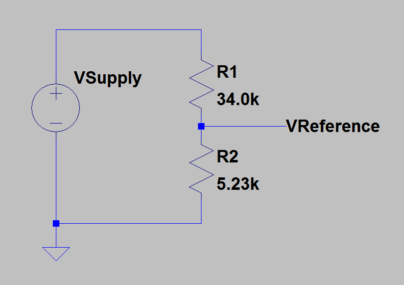
Figure 1: Dying Gasp Circuit.
Many electronic systems are required to generate an alarm when they detect their power failing – the alarm is referred to as a "dying gasp". These systems are required to generate a dying gasp alarm when their input voltage drops below a specified level.
The circuit in Figure 1 provides a typical implementation example. When the input voltage, called VSupply, is at a level where the voltage across R2 drops below VReference, a level that is accurately and inexpensively generated using bandgap voltage reference circuits.
Because of circuit tolerances associated with R1, R2, and VReference, there is a range VSupply values could trigger a dying gasp alarm. In this post, I will show three different ways to determine the range of critical VSupply values. The third method is the most interesting because it involves using feedback in a circuit simulator to solve generate the required supply voltage.
For those who are interested in more dying gasp design details, I addressed how to design a charge storage system to enable the hardware to generate a dying gasp alarm in this post.
For those who are interested, my Mathcad/LTSpice source and its PDF are here.
Background
Definitions
- Tolerance
- The total amount by which a given dimension may vary, or the difference between the limits. (Source: ANSI Y14.5M-1982)
- Worst-Case Analysis
- Worst-case circuit analysis is an analysis technique which, by accounting for component variability, determines the circuit performance under a worst-case scenario. (Source)
- Extreme Value Analysis (EVA)
- EVA involves evaluating a circuit's performance using every possible combination of extreme component value. It is not a statistical method – every possible combination of extreme component value is analyzed.
- Root Sum Square Analysis (RSS)
- RSS assumes that the design tolerance for a system parameter is composed of the sum of Gaussian distributed variables. Each variable is assumed to have tolerances that can be modeled using a centered normal distribution with the total tolerance range of ±3·σ about the mean. The overall tolerance of a system parameter is estimated by computing the square root of the sum of the squared variable tolerances.
- Monte Carlo Analysis
- Monte Carlo analysis is a statistical analysis that calculates the response of a circuit when device model parameters are randomly varied between specified tolerance limits according to a specified statistical distribution. (Source)
Three Approaches
I will use three different ways of determining the range of power supply values that will cause the system to generate a dying gasp.
- Arithmetic Sum
This is the traditional approach to worst-case analysis. It produces the absolute maximum and minimum values for a parameter. This approach has two shortcomings: (1) for complex systems, it is difficult to determine, (2) for many system, it produces a result that is so pessimistic that there is no way to make an economically feasible system.
- Monte Carlo method in Mathcad
For Monte Carlo analysis, we normally assume that the tolerance of a variable can be modeled using a uniform probability density. We then perform multiple analysis using values randomly generated variable values. This produces a set of output values will approximately reflect the probability density of the real product. The main issue with using Mathcad is that it requires that you have an algebraic solution for the system's response to the input variables. For complex systems, we frequently do not an explicit formula.
- Monte Carlo method in LTSpice
Same approach as for Mathcad, but implemented using a circuit simulator. This approach can handle very complex systems that would defeat Mathcad.
I should note that there are other approaches that could be used (e.g. RSS, EVA), but I will focus on the three methods I listed.
Using Feedback to Solve For a Circuit Value
In my third method (LTSpice-based), I use feedback to have the circuit determine the required power supply setting that causes the resistor divider to output the reference voltage. Figure 2 shows a block diagram of how that approach is implemented.
Analysis
Arithmetic
Figure 3 shows the the arithmetic approach. In this case, I applied Kirchhoff's voltage law to the circuit of Figure 1 and determined the supply voltage as a function of the resistor values and the reference voltage. The resulting formula was simple enough that the combination of component values required to produce extreme values could be determined by inspection. This situation rarely occurs in practice, but it occurred today.

Figure 3: Minimum/Maximum Solution Using Arithmetic Approach.
Monte Carlo in Mathcad
Figure 4 shows how I used Mathcad to perform the Monte Carlo analysis. Observe that the Monte Carlo analysis did not produce as extreme values as the Arithmetic approach. If I used more random iterates, I would get closer to the true minimum and maximum values.

Figure 4: Estimate of Minimum and Maximum Values Using the Monte Carlo Method.
Monte Carlo Method in LTSpice
Figure 5 shows I took the circuit of Figure 1 and used feedback to generate the vSupply value for a given set of R1, R2, and reference voltage values. I ran the simulation for 5000 sets of randomly selected component values.

Figure 5: Using Feedback to Solve For The Critical Supply Voltage.
Figure 6 shows the results of my simulation. As you can see, 5000 simulations were performed.

Figure 6: Plot of the Circuit Solutions.
Figure 7 shows a histogram of the results in Figure 5. The results of Figure 6 are consistent with the results of the previous two methods. As the central limit theorem would lead us to believe, the distribution of critical vSupply voltages has a Gaussian shape.

Figure 7: Histogram of the Critical Dying Gasp Supply Voltages.
Conclusion
I performed a worst-case analysis of a simple comparator circuit using three methods and got three consistent results – as I should have. The LTSpice approach was the most interesting to me because it can be performed using the LTSpice simulator on circuits for which I have no transfer functions.