Converting Specific Humidity to Relative Humidity

Quote of the Day

Keep away from people who try to belittle your ambitions. Small people always do that, but the really great people make you feel that you too, can become great.

— Mark Twain. As always, he said it just right.


Introduction

Figure 1: Relative Humidity Versus Temperature For a Fix Specific Humidity (24 grams of Water Vapor/kg of Air)

Figure 1: Relative Humidity Vs Temperature For
a Fix Specific Humidity (24 grams of Water
Vapor/kg of Air).

I often have to interpret odd test requirements. In a test specification based on GR-487, a humidity test is called out where we need to have a fixed specific humidity (i.e. 24 grams of water vapor per per kilogram of air). For a given specific humidity, the relative humidity will vary with temperature. Since my test gear can control relative humidity, I need to derive a relationship between relative humidity and the specific humidity, which I show in Figure 1.

This was a quick Friday afternoon calculation. I was a bit surprised that I could not find a table that contained this information – I pulled out Mathcad and solved the problem on my own.

Here is my Mathcad work if you are interested.

Background

GR-487 Test Requirement

Here is an excerpt from GR-487 that calls out the specific humidity requirement.

At temperatures above 32° F (90°F), the relative humidity may be limited to that corresponding to a specific humidity of 0.024 kg of water per kg of dry air. During the period of descending temperatures – i.e. 32° C (90°F) to 4.4° C (40° F) – the relative humidity shall be 80-95%.

There is a small error in this statement. Strictly speaking, the requirement is specified in terms of kg of water vapor versus kg of dry air. Technically, this term is known as the mixing fraction, but it is very close in value to the specific humidity. Both terms are described below.

Definitions

mixing fraction (symbol w) AKA Humidity Ratio (HR)
Ratio of the mass of water vapor to the mass of dry air. It is often expressed in terms of gram of water vapor per kg of dry air. Symbolically it is defined as w\triangleq \frac{{{{m}_{v}}}}{{{{m}_{d}}}}, where mv is the mass of water vapor, and md is the mass of dry air (Source).
Dew Temperature (symbol tdew)
The dew temperature is the temperature at which dew forms and is a measure of atmospheric moisture. It is the temperature to which air must be cooled at constant pressure and water content to reach saturation (Source).
Relative Humidity (symbol RH)
Relative humidity is the ratio of the partial pressure of water vapor to the equilibrium vapor pressure of water at the same temperature. Relative humidity depends on temperature and the pressure of the system of interest (Source).
Absolute Humidity (symbol AH)
Absolute humidity is the total mass of water vapor present in a given volume of air. It does not take temperature into consideration. Absolute humidity in the atmosphere ranges from near zero to roughly 30 grams per cubic meter when the air is saturated at 30 °C (Source).
Specific Humidity (symbol SH)
Specific humidity is the ratio of water vapor mass (mv) to the air parcel's total (i.e., including dry) mass (ma) and is sometimes referred to as the humidity ratio. Specific humidity is approximately equal to the "mixing ratio", which is defined as the ratio of the mass of water vapor in an air parcel to the mass of dry air for the same parcel. We can express the specific humidity as SH = \frac{w}{1+w} = \frac{m_v}{m_v+m_d}.

Analysis

Relative Humidity Given Dew Point and Temperature

Figure 2 shows how I computed the relative humidity given the air temperature and dew point. For references, see the documents in Appendix A or click on the links in Figure 2 (brown color).

Figure M: Relative Humidity Versus Temperature and Dew Point.

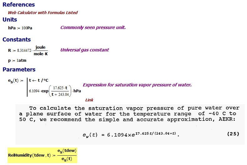
Figure 2: Relative Humidity Versus Temperature and Dew Point.

I perform a verification of this routine in Appendix B.

web calculator Reference Article

Calculation of Specific Humidity (SH) Given RH and Temperature (T) and Pressure (P)

Figure 3 shows how I calculated the specific humidity given the air temperature and relative humidity given the model in this paper. Here is a numerical example that I used to check my result. Further checks are done in Appendix C.

Figure 3: Specific Humidity Function.

Figure 3: Specific Humidity Function.

In Appendix D, I compare the the formula from Figure 3 to a standard psychrometric curve that relates the humidity ratio (HR) = SH/(1-SH) to relative humidity and temperature. The agreement is good.

Calculation of RH Given T and SH

In Figure 3, I have a relationship between SH vs RH, T, and P. In Figure 1, I need to invert this relationship to obtain RH vs SH, T, and P. I perform this inversion numerically (i.e. root function) in Figure 4 to generated Figure 1.

Figure 4: Mathcad Code to Plot Figure 1.

Figure 4: Mathcad Code to Plot Figure 1.

Conclusion

Our testing of an assembly was held up while we discussed the required RH required. I view this as another example of the endless number of unit conversions that I end up doing.

Appendix A: Key Reference Material

I am going to use Appendix A to store some useful reference material.

Appendix B: Reference Material For Checking Results

Figure 5 shows a table of dew points that I found on the web. I will duplicate that table using my routine for computing relative humidity given temperature and dew point.

Figure M: Reference of Dewpoints Values for Different Temperatures and Relative Humidities.

Figure 5: Reference of Dew points Values for Different Temperatures and Relative Humidities.

Figure 6 shows the same type of table generated by my Mathcad routine. The agreement at high temperatures (>20 °C) is excellent – less so at low temperatures. Since my GR-487 work is at high temperature, my results will be accurate.

Figure M: My Dew Point Calculations.

Figure 6: My Dew Point Calculation Results.

Figure 7 shows the Mathcad code that generated Figure 6.

Figure M: Mathcad code for Generating Reference Table.

Figure 7: Mathcad code for Generating Reference Table.

Web Reference

Appendix C: More Reference Material For Checking Results

Figure 8 shows a simple comparison of a table of specific humidity values generated using my SH formula for 100% humidity at various temperatures. A comparable formula from the web is also shown.

Figure M: Second Table Used for Checking My Model.

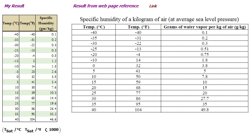
Figure 8: Second Table Used for Checking My Model.

Web Reference

Figure 9 shows the Mathcad code that generated the results of Figure 8.

Figure M: Mathcad Code for Generating Specific Humidity Example.

Figure 9: Mathcad Code for Generating Specific Humidity Example.

Appendix D: Psychrometric Curve vs Fig 3 Formula.

Figure 10 shows a comparison between the formula shown in Figure 3 and a standard psychrometric chart.

Figure 10: Psychrometric Chart vs Fig. 3 Formula.

Figure 10: Psychrometric Chart vs Fig. 3 Formula.

Posted in General Science | 7 Comments

Nuclear Spent Fuel Annual Generation Rate

Quote of the Day

The cave you fear to enter holds the treasure you seek.
— Joseph Campbell


Introduction

Figure M: Dry Storage of Spent Fuel.

Figure 1: Dry Storage of Spent Fuel (Wikipedia).

A coworker was telling me about a relative of his who is an engineer at a nuclear power plant. One of his relative's many jobs is to babysit nuclear waste casks (Figure 1) – a task which includes monitoring their temperature. These casks are warmed from the inside by the radioactive decay of the waste they hold. As I understand it, this job has good long-term security because these casks are going to be a safety hazard for tens of thousands of years.

I thought it would be an interesting exercise to estimate the amount of spent fuel generated by nuclear plants in the US each year. My analysis is rough, but I will be able to compare my estimate with the reported waste generation rates as a check on my math.

Background

Definitions

Gigawatt (GW)
109 W or 1000 Mega-Watts (MW).
tonne
I use this term for a metric ton or 1000 kg. A US ton is 2000 pounds or 907 kg. Both of these units are built-in Mathcad.

Nuclear Plant Sites in the US

The US has 99 active power reactors (Figure 2), with five units under construction and eighteen more planned.

Figure 2: Map of Nuclear Power Plants in the USA.

Figure 2: Map of Nuclear Power Plants in the USA (Source).

The Energy Information Administration (EIA) publishes information on all these plants. This information, coupled with some basic physics, will allow us to estimate the amount of spent fuel generated per year in the US.

Analysis

Amount of Waste Generated Per GW Per Year

Figure 3 shows my estimate for the amount of nuclear waste generate per GW per year. This estimate of 27.9 tonne/GW-year is rough because it assumes that 100% of the fuel is burned, which is very unlikely. However, we are just looking to generate an estimate.

Figure M: Uranium Fuel Burn Rate Per Year Per GW.

Figure 3: Uranium Fuel Burn Rate Per Year Per GW.

Link to page on power plant efficiency

Estimate Comparison with Reality

The EIA reports that 39.7 GW-days of energy are generated per metric tonne of fuel, which is the reciprocal of what I estimated. Let's compare this value to my calculation (Figure 4).

Figure M: Comparing My Estimate to EIA Estimate.

Figure 4: Comparing My Estimate to EIA Estimate.

Annual US Spent Fuel Generation Rate

Figure 5 shows the amount of MW-hours per month of energy generated in the US. We can use this chart to estimate the amount of spent fuel generated each year.

Figure M: US Electrical Energy Generation Per Month.

Figure 5: US Electrical Energy Generation Per Month (Source).

Figure 6 shows my estimate for the amount of spent fuel generated annual in the US.

Figure M: My Estimate for the US Annual Spent Fuel Generation Rate.

Figure 6: My Estimate for the US Annual Spent Fuel Generation Rate.

The EIA published annual spent fuel data, which I show in Figure 7. Note how our rate of accumulated spent fuel has linear growth – you would expect that because we have not been building new plants.

Figure M: EIA Data on Annual Spent Fuel Generation Rate.

Figure 7: EIA Data on Annual Spent Fuel Generation Rate (Source).

While Figure 7 is a bit hard to read exactly, it appears to show ~2450 tonnes of spent fuel are generated annually, which agrees very well with my estimate.

Conclusion

This was a quick calculation that had surprisingly good agreement with reality. I am floored by the magnitude of the spent fuel storage problem – we are talking about  thousands of tonnes of dangerous stuff that will be around for thousands of years.

Posted in General Science | 1 Comment

Power Plant Conversion Efficiencies

Quote of the Day

All of the great leaders have had one characteristic in common: it was the willingness to confront unequivocally the major anxiety of their people in their time. This, and not much else, is the essence of leadership.

— John Kenneth Galbraith


Introduction

Figure 1: Block Diagram of a Combined Cycle Power Plant.

Figure 1: Block Diagram of a
Combined Cycle Power Plant
(Source).

While crawling around the Energy Information Administration (EIA) web page, I found some data on the energy conversion efficiencies of power plants based on the fuel that they use. I thought the data was interesting and worth going through here.

From my standpoint, the most interesting part about this information was the efficiency of electricity production using the combined cycle power generation approach (Figure 1). I had no idea that power generation using natural gas could be ~10% more efficient than traditional coal, petroleum, and nuclear generation approaches. It looks like the higher temperature exhaust available in a natural gas system can be used to generate steam to drive a secondary generator and recover some of the energy normally lost in the exhaust. In some respects, it reminds me of a turbocharger because of the focus on using the energy present in the exhaust.

Background

Definitions

Conversion Efficiency
Energy conversion efficiency (η) is the ratio between the useful output of an energy conversion machine and the input, in energy terms.
Combined Cycle Power Generation
A combined-cycle power plant uses both a gas and a steam turbine together to produce up to 50 percent more electricity from the same fuel than a traditional simple-cycle plant. The waste heat from the gas turbine is routed to the nearby steam turbine, which generates extra power (Source).
Theoretical Conversion Efficiency
The maximum possible efficiency from a heat engine, which is given by the formula

\displaystyle {{\eta }_{{\text{max}}}}=1-\frac{{{{T}_{c}}}}{{{{T}_{h}}}}

where Th is the absolute temperature of the hot source and Tc that of the cold sink, usually measured in Kelvin (Source).

This formula tells us that having a very hot source and a very cold sink will make a heat engine more efficient. The impact on efficiency of a high-temperature source and a low-temperature sink likely drives the efficiency improvement seen with natural gas combined cycle plants.

EIA Data

The EIA actually reports on the nominal thermal energy required (in BTU)  for every kilo-Watt (in kW) of electrical power generation by fuel type – a metric known as the operating heat rate. Observe how the natural gas operating heat rate is reducing every year. This reflects the introduction of combined cycle technology, which is more efficient.

Figure M: EIA Efficiency Data By Year and Fuel.

Figure 2: EIA Efficiency Data By Year and Fuel.

I realize that "BTU/kW-hr" is a strange unit. In the US, we usually use BTU when we are talking about thermal energy and kW-hr for electrical power. This allows us to know what type of energy is being discussed just by the units being used. Unfortunately, it also means that we have a bit of unit conversion to go through in order to get the efficiency number we want.

Analysis

Unit Analysis

Figure 3 shows how to convert the EIA data into conversion efficiency.

Figure 3: Unit Conversions on EIA Data

Figure 3: Unit Conversions on EIA Data

Efficiency Calculation

Figure 4 shows how the EIA data was converted to efficiencies.

Figure 4: Efficiency Calculations.

Figure 4: Efficiency Calculations.

EIA Efficiency Data

Conclusion

I find it interesting that coal, petroleum, and nuclear have similar conversion efficiencies of ~33%. Natural gas is the outlier with 10% more efficiency than the others.

The following quote describes the rise of efficiency in electricity production using natural gas.

An aggressive buildup of high-efficiency “combined-cycle” natural gas power plants in the early 2000s began changing the game. Over the past 10 years, the average efficiency of natural gas plants has been improving continuously as more of these technologically superior systems were built and called upon to deliver power.

Although there is chatter in monthly numbers, the U.S. fleet of natural gas power plants is now achieving about 44 per cent efficiency. Rising from 32 per cent to 44 per cent is highly significant; compared to 10 years ago, an average utility today needs 27 per cent less natural gas to generate the same amount of electricity.

I can confirm the 27% reduction in fuel use for the same amount of electrical output power with the following calculation (Figure 5).

Figure 5: Reduction in Natural Gas Usage for a Given Electrical Energy Output.

Figure 5: Reduction in Natural Gas Usage for a Given Electrical Energy Output.

Posted in General Science | 1 Comment

Deer Crossing Signs Are for People, Not Deer

Quote of the Day

Until the late modern era, more than 90 per cent of humans were peasants who rose each morning to till the land by the sweat of their brows. The extra they produced fed the tiny minority of elites – kings, government officials, soldiers, priests, artists and thinkers – who fill the history books. History is something that very few people have been doing while everyone else was ploughing fields and carrying water buckets.

— Yuval Noah Harari, from his book 'Sapiens: A Brief History of Humankind'. His book is an interesting look at how human society developed.


My sister sent me this link about a phone call to a radio call-in show. The woman on the call does not realize that deer crossing signs are warnings for people and are not instructions for deer. You might think this is a joke, but I have heard real people having this discussion.

Posted in Humor | 3 Comments

Churchill's Plea for Brevity

Quote of the Day

Math is like love; a simple idea, but it can get complicated.

Source uncertain, often attributed to G. Pólya or P. Drábek (?).


Figure 1: Winston Churchill (Source).

Figure 1: Winston Churchill (Source).

I am stunned at the length of the product specifications I have to deal with today. Not many years ago, a laser driver specification might have 20 pages of text. Today, it is not unknown for a laser driver specification to go on for hundreds of pages. I really wish documents were shorter. I actually believe that the word processor has enabled people to write more with way too much ease.

It turns out this has been a problem for a long time. I recently saw a memo from Winston Churchill (Figure 1) on Quora about the need for brevity in communication. His message is timeless.

Figure 2: Churchill's Call For Brevity.

Figure 2: Churchill's Call For Brevity.

Posted in Technical Writing | 1 Comment

Decision Making Using the Analytic Hierarchy Process

Quote of the Day

There are stars whose radiance is visible on Earth though they have long been extinct. There are people whose brilliance continues to light the world even though they are no longer among the living. These lights are particularly bright when the night is dark. They light the way for humankind.

Hannah Szenes. I love this quote. I also recommend that you read about Hannah Szenes – a remarkable woman.


Introduction

Figure 1: NASA AHP Example.

Figure 1: NASA AHP Example.

I gave a seminar a few days ago on System Engineering – a favorite subject of mine. One of the topics covered during my System Engineering seminar was decision making. Specifically, I speak about how I want trade studies to be performed in my group. I have participated in hundreds of trade studies, and I have used many different approaches.

I usually perform trade studies using some form of Multi-Criteria Decision Making (MCDM). There are numerous types of MCDM, many of which are enumerated here. I generally use one of two methods: Kepner-Tregoe (K-T) and Analytic Hierarchy Process (AHP).

I took a week-long K-T course back in the 1980s, and I have used this methods for most of my trade studies because it is the most intuitive approach I know. It does not make decision-making easier, but it does provide a good framework for making decisions. One complaint about K-T is that it simply moves the stress of arguing about alternatives to arguing about the weighting of criteria – a valid point.

AHP is an interesting alternative to K-T. It is more mathematical in nature, and it bases the criteria weighting on the pair-wise comparison of the relative importance of the criteria. This mathematical aspect makes it more mysterious to folks, and I do not use this approach in presentations to upper management.

Since AHP is more complex than K-T, I thought I would work through an example here. I will going through the details of a NASA trade study example on automotive fuel options to illustrate how to apply the method.

Background

Definitions

Multi-Criteria Decision Making (MCDM)
MCDM is a sub-discipline of operations research that explicitly considers multiple criteria in decision-making environments (Source).
Analytic Hierarchy Process (AHP)
AHP decomposes decision into a hierarchy of more easily comprehended sub-problems, each of which can be analyzed independently. Once the hierarchy is built, the decision makers systematically evaluate its various elements by comparing them to each other two at a time, with respect to their impact on an element above them in the hierarchy. In making the comparisons, the decision makers can use concrete data about the elements, but they typically use their judgments about the elements' relative meaning and importance. It is the essence of the AHP that human judgments, and not just the underlying information, can be used in performing the evaluations (Source).
Sensitivity Analysis
The study of how the uncertainty in the output of a mathematical model or system (numerical or otherwise) can be apportioned to different sources of uncertainty in its inputs (Source).

MCDM Basics

Figure M: Standard MCDM Tabular Format.

Figure 2: Standard MCDM Tabular Format.

All MCDM methods work with a table similar to that shown in Figure 2, which consists of:

  • A set of alternatives to decide between (far left column of A's)
  • A set of criteria (top row of C's) used to evaluate the alternatives.
  • A set of criteria weights (row of W's below the C's) to set the relative priority of the criteria.
  • A set of grades for each criteria that have been assigned to each alternative (small a's).

It is important that each criteria be scored using the same scale. The grades given for each criteria can then be priority weighted and aggregated in various ways. Both K-T and AHP are known as weighted-sum models. Other approaches exist (e.g. weighted-product model).

AHP Basics

Concept

The key concepts in AHP are:

  • Each decision can be broken down into a series of sub-decisions.
  • These sub-decisions can be broken down into a set of evaluations based on specific criteria.
  • The relative performance each alternative against the criteria can be evaluated in a pair-wise manner according to the rubric in Figure 3. These comparisons are placed in a table for eigenvector determination. Note that comparisons must meet the reciprocal axiom, which states comparison(i,j)=1/comparison(j,i) where i and j are array indices. The AHP algorithm includes a measure for how well the reciprocal axiom is met – it does not need to be met exactly in practical applications.
  • The table of pair-wise comparisons can be aggregated into weights or preferences using eigenvector methods. I should note that there are other ways of aggregating pair-wise comparisons, but the eigenvector method is the most common.

I have found an excellent master's thesis that provides a simple and thorough discussion of how to build the pair-wise comparison table and the eigenvector approach to criteria weighting. I should also mention that the Wikipedia has an excellent example, which unfortunately does not go into the mathematical details.

Grading Rubric

Figure 3 shows the rubric for how comparison results are to be graded on a scale from 1 to 9. You can use other scales, but you need to be consistent.

Figure M: Comparison Scale.

Figure 3: Standard AHP Comparison Scale.

Process

Figure M: Decision-Making Process.

Figure 4: Decision-Making Process.

Let's go through the steps in the decision making process (Figure 4).

  • Determine the criteria relevant in making your decision. In general, your criteria will include both qualitative and quantitative values.
  • Determine the set of all viable alternatives.
  • Evaluate each alternative relative to your criteria.
  • Using Figure 3, scale or code the results of your evaluation in the form of a relative grade from 1 to 9, with 1 being equal and 9 being much better.
  • Apply the AHP algorithm. It will generate a set of weights for each criteria.
  • Look at your result. The alternative with the largest score is the best choice relative to your criteria.
  • Because your criteria and their evaluation undoubtedly are subjective, vary the your qualitative evaluations and scaling (coding) slightly to determine if your outcome is strongly dependent on your specific assumptions.

If you see that your decision is very sensitive to your scaling or the qualitative aspects of your criteria, consider adding more criteria to evaluation and see if you can make the decision less subjective.

I should point out that you will never remove all subjectivity from the process.

Analysis

You can access my Mathcad file and its pdf version here.

Determine the Decision-Making Criteria

Most decisions involve many complex qualitative and quantitative parameters. We are working a simple problem here with the decision criteria limited to four items:

  • CO2 Emissions (grams/km)
  • Fuel Cost ($ /mile)
  • Range (miles)
  • Vehicle Cost ($)

Each criteria has different units. Also, "goodness" can be small (e.g. cost) or big (e.g. range). We need to code these results in a way so that they are on the same scale. The NASA trade study reference chose to use a scale from one to ten, which differs from AHP's typical one through 9. It really does not matter as long as you are consistent.

Determine the Alternatives

Because this is a "toy" problem, there are only three alternatives:

  • Propane
  • Hybrid-Electric
  • Electric-Only

This is a large enough set to illustrate the principles involved.

Evaluate the Alternatives Relative to the Criteria

Figure 5 shows the raw performance data for the three alternatives. In Figure 5, I also include a couple of items used for calculation purposes:

  • Random Index (RI): A list of values defined in the AHP algorithm. This is discussed in the master's thesis I reference above.
  • n(x): a function that normalized vectors so that the element-sum equals 1.
Figure M: Raw Performance Metrics.

Figure 5: Raw Performance Metrics and A Couple of Utility Items.

Scale the Criteria from 1 to 10

Figure 6 shows how I linearly map my performance metrics to the range from one to ten. You certainly could use a nonlinear mapping if that makes sense. For example, HP occasionally would optimize for performance/cost2.

Figure M: Code the Results in a Manner that Allows Direct Comparison.

Figure 6: Code the Results in a Manner that Allows Direct Comparison. I arbitrarily chose to normalize the sum of each set of grades to one to be consistent with the NASA example.

Apply the AHP Algorithm

Determine the Weights to Apply to Each Criterion

Figure 7 shows the pair-wise preference matrix generated for the NASA study. We can compute the "best" aggregate weight vector using an eigenvector-based approach.

Figure M: Generate the Criteria Weighting or Preferences.

Figure 7: Generate the Criteria Weighting (AKA Preference Vector).

Generate the Scores

The actual scoring is quite simple – multiply the Preference vector times the array of coded performance metrics. We obtain one score for each alternative (Figure 8).

Figure M: Scoring the Alternatives.

Figure 8: Scoring the Alternatives.

Look at the Results

Figure 9 shows a summary of my decision-making inputs.

Figure M: Presentation of My Final Result.

Figure 9: Presentation of My Final Result.

Perform Sensitivity Analysis

Because this is a "toy" problem, I will not be performing any sensitivity analysis. However, it would be very easy – just vary how I code  the input results and see if my outcome changes

Conclusion

While my scoring of the alternatives against the criteria was different than in the NASA example, my final scores for the alternatives are quite similar to those of the NASA paper.

My intent here was to review a NASA example in fine-detail.Their example was simple but provided a good general vehicle for illustrating how AHP is applied.

Posted in General Mathematics, Management | 1 Comment

Circuit Analysis Using a Two-Port Transformation

Quote of the Day

The power of instruction is seldom of much efficacy except in those happy dispositions where it is almost superfluous.

— Gibbon. I think this quote is a bit harsh, but not off too much. I recently have been taking some online classes where I work problems and can ask the instructor questions if I have issues. In this case, there really is no instruction – I am just reading the book and getting the opportunity to ask an expert questions. It works.


Introduction

Figure 1: Simple Voltage Regulator with Current Limit.

Figure 1: Simple Voltage Regulator with Current Limit.

I was doing some reading on the Planet Analog web site when I encountered an interesting blog post by Dennis Feucht on a simple BJT-based voltage regulator with an output current limit.

I thought Dennis' post was good because it (1) provided a very clean demonstration of the use of Thevenin and beta transform equivalent circuits for analysis, and (2) it also provide me a good demonstration for how to use a computer-algebra system to help you design a circuit.

I am always looking for good Mathcad reference applications for my staff. In this post, I illustrate the the basic circuit transformation and then use Mathcad to determine component values and predict circuit performance. I also simulate the circuit using LTSpice (Appendix A).

I should point out that even though this circuit is simple, the algebra can get overwhelming. The gods of electronics work by simple rules, but they have no fear of algebra.

Background

Motivation

I am always looking for simple power conversion circuits to use for my home projects. I like to see current-limited power sources for safety reasons. The performance of this circuit is not great, but there are ways to improve it – I will cover these later.

General Operation

This circuit really operates in two modes (see Appendix A for simulation details):

  • Q1 Saturated

    When not limiting the output current, Q1 is saturated. As such, Q1 dissipates relatively little power.

  • Q1 Active

    When limiting the output current, Q1 is in the active region and is dissipating significant power.

Analysis

Simple Model

Figure 2 shows the circuit of Figure 1 with a simple DC PNP transistor model and the base circuit transformed to a Thevenin equivalent.

Figure M: Equivalent Circuit. Figure M: Equivalent Circuit.

Figure 2: Equivalent Circuit.

Circuit with Beta Transformation

Figure 3 shows the circuit of Figure 2 using a beta transformation.

 Figure M: Equivalent Circuit with Impedance Transformation.


Figure 3: Equivalent Circuit with Impedance Transformation.

Derivations

Derivation of Formulas for the RI and RB Values

Figure 4 shows how to analyze the circuit in Figure 3 for RE and RB. Note how I grabbed an intermediate term to determine the constraint for a positive RE value.

Figure M: Derivation of RI and RB.

Figure 4: Derivation of RI and RB.

Derivation of Constraint on RE

Figure 5 shows how to derive the constraint on RB that ensures positive RE.

Figure M: Derive Constraint on RB.

Figure 5: Derive Constraint on RB.

Derivation of RE Equation

Figure 6 shows to derive the expression for RE. I start with the expression shown in Figure 4 with the bubble numbered 1.

Figure 6: Derivation of RE.

Figure 6: Derivation of RE.

Example

Figure 7 shows the example worked on the blog post.

Figure M: Example from the Blog Post.

Figure 7: Example from the Blog Post.

Conclusion

This was a good illustration of the capabilities of a computer algebra system for a simple electronic circuit. This current-limited voltage source served that purpose well.

Appendix A: LTSpice Simulation

I captured the circuit in LTSpice (Figure 8).

Figure 8: LTSpice Version of This Circuit.

Figure 8: LTSpice Version of This Circuit.

Figure 9 shows my simulation result. The values are in the range I would expect for this circuit.

Figure 9: LTSpice Output.

Figure 9: LTSpice Output.

Posted in Electronics | 2 Comments

Lessons from RP Feynman

Quote of the Day

Our Richie? The world’s smartest man? God help us!

— Lucille Feynman, mother of RP Feynman. This was her reaction to the statement in Omni Magazine (1979) that her son was "Smartest Man in the World." No man has a brain cell in the eyes of his wife, mother, or sister. Some things never change.


Introduction

Figure 1: Richard P. Feynman, 1965 Nobel Prize Winner in Physics (Source).

Figure 1: Richard P. Feynman,
1965 Nobel Prize Winner in
Physics (Source).

There is almost a cottage industry in RP Feynman quotes and stories.  For an engineer, there is much gold to mined in his approach to problem-solving. Long ago, I read his book Surely You're Joking Mr. Feynman, and I have treated him as source of inspiration ever since.   I was drawn to the joy he expressed about solving problems, and his skill in sharing that joy.

As you would expect for a person of this intellect, his career is surrounded by some controversy. Here are three articles worth reading to get a feel for his legacy.

As a mere mortal, I really cannot duplicate his problem-solving approach, but I can learn from it. I wanted to share the parts of his problem-solving approach that I work to emulate – admittedly poorly.

His Problem Solving Lessons

You need to work problems

Feynman said:

You do not know anything unless you have practiced.

I often hear people say that "I read the book, but I cannot solve any of the problem." Reading is different than understanding – understanding requires much more engagement.

You need to work lots of problems

Feynman's last writing on a blackboard said:

Know how to solve every problem that has been solved. What I cannot create, I do not understand.

This is a tough one for a mere mortal, but I work on problems all the time to help retain my proficiency.

Focus

Feynman said:

To do high, real good physics work you do need absolutely solid lengths of time, so that when you’re putting ideas together which are vague and hard to remember, it’s very much like building a house of cards and each of the cards is shaky, and if you forget one of them the whole thing collapses again. You don’t know how you got there and you have to build them up again, and if you’re interrupted and kind of forget half the idea of how the cards went together—your cards being different-type parts of the ideas, ideas of different kinds that have to go together to build up the idea—the main point is, you put the stuff together, it’s quite a tower and it’s easy [for it] to slip, it needs a lot of concentration—that is, solid time to think—and if you’ve got a job in administrating anything like that, then you don’t have the solid time.

I believe that multi-tasking is a myth. I work hard to focus my mental energy, but it is hard when you are in a management position. Sometimes it is hard to get thirty seconds of uninterrupted thought, but you have to find a way to focus.

Work to develop you own point of view

Feynman said:

Science alone of all the subjects contains within itself the lesson of the danger of belief in the infallibility of the greatest teachers in the preceding generation. Learn from science that you must doubt the experts. As a matter of fact, I can also define science another way: Science is the belief in the ignorance of experts.

and

Do not read so much, look about you and think of what you see there.

I regularly read statements by experts that later prove to be wrong. I have made some doozies. In fact, I just found an error in a published derivation performed by one of today's best electrical engineers. I contacted him, he immediately saw the error, and thanked me for helping him out. We all make mistakes.

Here is a good essay on the topic.

Always look for simpler viewpoints

Here is a quote from Feynman on his inability to explain why spin one-half particles obey Fermi Dirac statistics:

You know, I couldn't do it. I couldn't reduce it to the freshman level. That means we really don't understand it.

It is always important to simplify things as much as possible. When I worked at HP, they used to provide a bounty for bugs found just before code release. The champion bug finder used to read the source code and look for complex code sections. He said that complexity usually meant that the software engineer did not really understand what he was doing and that bugs were likely in that section of code.

I always review my solutions to see if there is an easier way to get the same or approximately same result. There is a lot of insight to be gained from reviewing your results.

I should also mention that I spend quite a bit of time on understanding the problem statement. I constantly restate the problem in alternative ways to try to gain insight into what the critical factors are.

Keep a list of problems you have not been able to solve

Feynman said:

You have to keep a dozen of your favorite problems constantly present in your mind, although by and large they will lay in a dormant state. Every time you hear or read a new trick or a new result, test it against each of your twelve problems to see whether it helps. Every once in a while there will be a hit, and people will say, 'How did he do it? He must be a genius!'

I keep of list of problems that have bothered me for a long time – decades in some case. I regularly review the list and a few drop off every year. Unfortunately, a few get added every year as well. The list never shrinks.

Give yourself a break

Feynman said:

I know how hard it is to get to really know something; how careful you have to be about checking the experiments; how easy it is to make mistakes and fool yourself. I know what it means to know something.

Getting to really know something is not easy. For example, it took me a long time to become comfortable as a circuit designer, and I continue to learn a scary amount on a regular basis.

Posted in General Science | Comments Off on Lessons from RP Feynman

State GDPs Relative to National GDPs

Quote of the Day

The only thing that holds you back from getting what you want is paying attention to what you don’t want.

— Abraham-Hicks


Introduction

Figure 1: US State GDPs Compared to Country GDPs.

Figure 1: US State GDPs Compared to Country
GDPs (Source). All data is from 2012.

I am amazed at all the different lists on the Wikipedia. Today, I came across a list of all the US state GDPs and a map (Figure 1) that shows how the state GDPs compare to the GDPs of various nations. I have to admit that I think this is a very interesting chart.

My interest are motivated by  some recent online courses I have taken on databases, web scraping, and dashboards. I now have some skills that I want to practice. Let's see if we can reconstruct this map using data from the Wikipedia.  The chart in Figure 1 is based on 2012 GDP data. Since my analysis will be based on 2015 state data and 2014 national GDP data, I expect that my chart will be a bit different than Figure 1. By its very nature, this comparison is approximate.

Background

Approach

I will use Visio to generate the chart. I have done similar charts in two other posts:

  • The Yearly Cost of Running Networking Gear (Link)
  • Customer Service Math (Link)

I will scrape tables for state and national GDPs from the Wikipedia for analysis in Excel. I will use Excel to determine which nations have GDPs closest to the states. I will then link my list of state and matching national GDPs to a US map that I use all the time in Visio.

Analysis

Figure 2 shows my version of Wikipedia's chart (Figure 1). The easiest way to understand what I did is to look at the Excel and Visio files (source). I was impressed with how well I was able to find matching national GDP values. The maximum matching error was 10%, with many errors under 2% (Appendix A).

Figure 2: My State GDP Map with Comparable National GDPs.

Figure 2: My State GDP Map with Comparable National GDPs.

Conclusion

This is an interesting way to look at the size of the various state economies. I must admit that I was surprised to see that the economy of California is approximately the same size Brazil's economy.

Appendix A: Matching Quality

National and state GDPs will never match exactly. I plot the errors in Figure 3. The largest error occurred between Oklahoma and Bangladesh at 10%.

Figure 3: Matching Errors.

Figure 3: Matching Errors.

Posted in software | 2 Comments

Typical Field Deployment Issues

Quote of the Day

What is it that breathes fire into the equations and makes a universe for them to describe?

— Stephen Hawking. It seems that everyone at some point wonders why mathematics works.  Wigner probably articulated this sense of wonder most effectively in his "Unreasonable Effectiveness of Mathematics" lecture. When I was at university, I attended a similar lecture given by Hamming.


I was looking at some photographs of a fiber-optic deployment, and I thought you might find it interesting seeing the details of what goes into the "green yard furniture" that quietly sits in the yards of many people (Figure 1). The fiber electronics is slung on a metal bar above the hole in the ground – all the cabling comes up from the hole. The plastic green cover behind the hole is intended to provide some environmental protection and a decent appearance.

As you can see, the hole is flooded. I could not describe all the snakes, frogs, salamanders, ants, bees, and other critters that we find inside these enclosures. I am very careful when I pull the plastic covers off. That has not always been the case. During a trip to Florida, I started to pull a plastic cover off rather cavalierly when a technician warned me that he uncovered a coral snake in this particular enclosure during his last inspection. At that point, I decided it would be wise to proceed more carefully.

Figure 1: Flooded Fiber-Optic Enclosure.

Figure 1: Flooded Fiber-Optic Enclosure.

I should mention that you will see also these metal electronic enclosures hung from utility poles as well (Figure 2).

Figure 2: Utility Pole Deployment.Figure 2: Utility Pole Deployment.

Figure 2: Utility Pole Deployment.

Posted in Fiber Optics | 1 Comment