Quote of the Day
A good stack of examples, as large as possible, is indispensable for a thorough understanding of any concept, and when I want to learn something new, I make it my first job to build one.
— Paul Halmos
Introduction

Figure 1: Examples of Electrolytic Capacitors
that Failed Because of Outgassing.
Our optical products are powered by AC power converters (e.g. wall adapters, uninterruptible power sources) that we buy from outside sources. Over the last two weeks, I have been dealing with a number of aluminum electrolytic capacitor failures in these power products. Like all components, electrolytic capacitors eventually do wear-out (e.g. Figure 1). Unfortunately, their lives are relatively short (~15 years) compared to other components in the system. We have had some of these power sources in the field for nearly ten years, so we are starting to see some worn-out capacitors.
In this post, I will discuss how we predict the lifetime of aluminum electrolytic capacitors in real applications. Unlike most digital components, electrolytic capacitor lifetimes vary markedly based on the level of stress that the power converter designer chooses to impose upon them.
Background
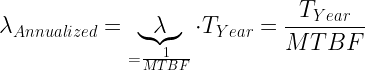
Vendor Reliability Material
Here are the vendor materials upon which I based this post:
Each of the models presented are similar but slightly different. You need to adjust your model based on the vendor parts you are using. In this post, I will be using Jianghai for my reference example.
Definitions
- Rated Lifetime (symbol L0)
- The nominal lifetime of the capacitor when operated at its rated ripple current, rated operating temperature, and limited voltage stress (i.e. applied voltage less than half the rated voltage). The rated lifetime is measured by the capacitor's manufacturer during stress testing and is usually shorter than the capacitor's lifetime in an application.
- Predicted Lifetime (symbol L)
- The predicted lifetime of the capacitor in a specific application. In most applications, the predicted lifetime is longer than the rated lifetime because applications usually do not operate at the maximum rated temperature, voltage, and ripple current.
- Equivalent Series Resistance (symbol RESR)
- Equivalent series resistance causes heat generation within the capacitor when AC ripple current flows through the capacitor. Maximum ESR is normally specified at 120Hz, 20°C.
- Applied Ripple Current (symbol IA)
- The applied ripple current is the Root-Mean-Square (RMS) value of alternating current flowing through a capacitor. This current causes an internal temperature rise because of the power generated in the ESR of the capacitor.
- Rated Ripple Current (symbol IR)
- The ripple current at which the vendor specifies L0.
Approach
The basic modeling approach can be described as follows:
- The capacitor is subjected to two stresses:
- The temperature within the capacitor.
The temperature within the capacitor is driven by (1) the ambient temperature of the capacitor, and (2) the power dissipated within the capacitor. Because we cannot directly measure the internal temperature of the capacitor, the capacitor vendors provide ways of estimating the internal temperature rise within the capacitor. Most vendors assume that the lifetime of a capacitor doubles for every 10 °C decrease in internal capacitor temperature, which I will assume here.
- The voltage applied to the capacitor.
Every vendor models the lifetime impact of the voltage applied to a capacitor using a power law of the form  , where Va is the applied voltage and Vr is the rated voltage. However, the vendors do not all agree on the value of n that should be used, and n must be adjusted for each vendor.
- We predict the internal temperature by using the ambient temperature of the air around the capacitor plus the internal temperature rise caused by the ripple current passing through RESR.
- There are different ways to model the amount of internal temperature rise for a given ripple current.
- The manufacturer will state an internal temperature rise value (e.g. ΔT = 5°C in my example below) at the rated ripple current IR. We can then scale this temperature for the application's ripple current IA.
- The manufacturer will specify a parameter that relates ambient temperature and capacitor case temperature to the core temperature (e.g.
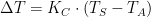 , where KC is our conversion parameter, TS is the capacitor's surface (i.e. case) temperature, and TA is the ambient temperature. This approach requires measuring the capacitor's case temperature.
- The manufacturer will specify a thermal resistance (e.g. Θ) or thermal parameter (e.g. Ψ) that relates the power dissipated by the ripple current in the capacitor (i.e.
 ) to the internal temperature rise ΔT.
Standard Model
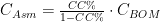
My preferred form for the capacitor lifetime equation is shown in Equation 1. There are numerous different ways to express this equation, but they are all algebraically equivalent. This model assumes that power losses within the capacitor due to leakage are negligible.
| Eq. 1 |
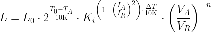
|
where
- L0 is capacitor lifetime when operating at maximum temperature, ripple current, and a specific voltage.
- T0 is maximum operating temperature.
- TI is capacitor internal temperature, which I normally estimate using the equation
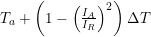 . There are other ways to estimate the internal capacitor temperature, but this is the approach I will use for this post.
- ΔT is the internal temperature rise over the capacitor's case temperature at the rated ripple current IR. The vendors often state the anticipated ΔT when operating at a ripple current of IR. I usually see ΔT value of 5 °C or 15 °C.
- n is a lifetime modeling parameter that varies by vendor. For the lifetime example that I work in this post, I will assume that n =0 for VA/VR < 0.5 and n = 2.5 otherwise.
- Ki is a lifetime modeling constant. For the lifetime example that I work in this post, I will assume that Ki = 4 when the IA/IR > 1 and the capacitor temperature is at its max (T0 = 105 °C in this case), otherwise Ki = 2.
I should note that the term  will change sign when IA/IR > 1. Instead of acting as a lifetime multiplier, this term now begins to decrease the lifetime of the capacitor. This means that exceeding the rated ripple current specification on an electrolytic capacitor is a very bad thing to do.
I do spend a bit more time on Equation 1 in the Appendix.
Analysis
Objective
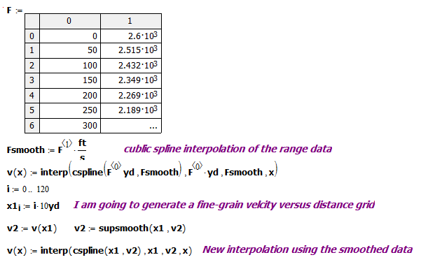
My plan here is use Equation 1 to plot L/L0 as a function of IA/IR and TA, which will duplicate the graphic shown in Figure 2 (Source).

Figure 2: Graphic of Capacitor Lifetime Multipliers.
Graphic Generation
I captured Equation 1 using Mathcad and plotted it assuming that:
- VA/VR = 1.
- ΔT = 5 °C, which is specified for the CD 297 BB series capacitor when TA = 105°C and IA/IR = 1.
I will vary TA and the IA/IR to generate the contours shown in Figure 3.

Figure 3: Calculations in Mathcad.
Figure 4 show my plot. It is very similar to Figure 2.

Figure 4: My Version of the Lifetime Multiplier Graph.
Conclusion
I regularly receive questions from other engineers on how to model the lifetime of electrolytic capacitors. I hope this worked example provides a useful reference.
Appendix A: A More Detailed Look at Equation 1.
Figure 5 shows a more detailed derivation of Equation 1. In typical applications (i.e. current below rated and voltage below rated), Equation 1 can be derived using the Arrhenius relationship and the power-law voltage stress model. When operating at maximum temperature and with ripple currents above the rating value, the term exponent base of 2 changes to 4. I have never used a capacitor with that level of stress.

Figure 5: A Detailed Derivation of Equation 1.


 .
. .
. .
. .
.

